The Process Behind
Thinking about the future is a familiar process for most of us, and something we often do on an individual level. We think about what we’ll have for dinner tonight, envision our next summer getaway, or even consider our retirement. However, when it comes to envisioning long-term, collective futures like the future of healthcare, things become more complex. That’s where the fields of futures studies and speculative design come into play, offering diverse tools and strategies to systematically explore, investigate, and imagine potential futures.
We often receive the question “how did you do the project?” In this – rather detailed – section of the website, we’ll provide insights into the steps we took and the decisions we made throughout the journey.
The open call
Our journey began with Vinnova, the Swedish Innovation agency, launching their open call “Prototypes for Futures.” As designers employed within the innovation unit of a prominent public hospital in Stockholm, we saw this as an opportunity to realize a longstanding ambition; doing a speculative design project around healthcare. Out of numerous submissions, our project proposal was among the fortunate eleven to receive funding.
Horizon scanning
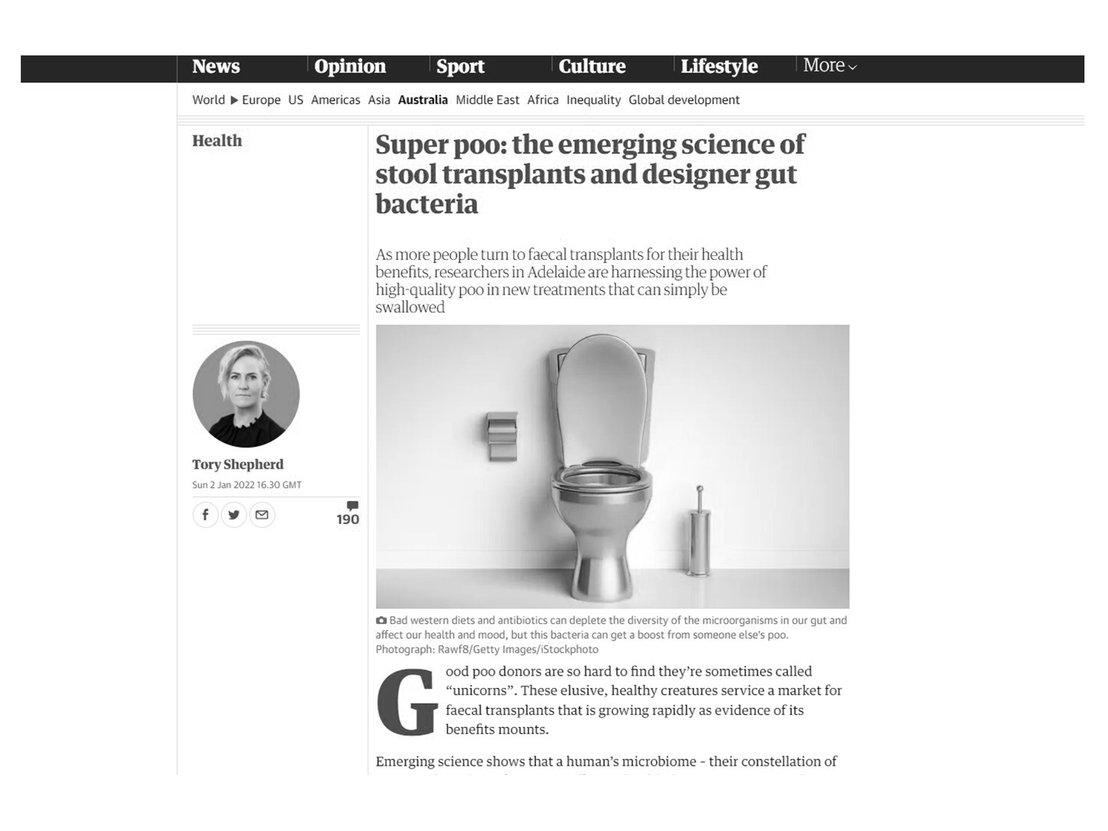
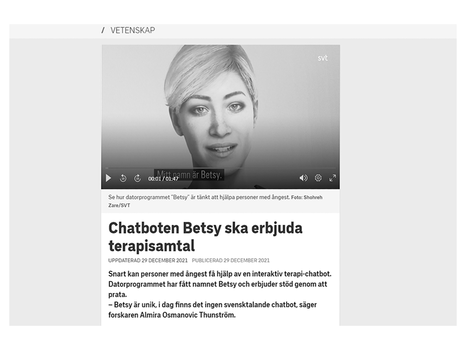
We kicked off the project with an extensive scan of trends and what are known as ‘weak signals’—early indicators of change or emerging issues that could hold significant future implications. This involved a thorough online search, reading articles and books, listening to podcasts, and watching documentaries. We sought out the latest scientific research, technological advancements, evolving behaviors, innovative services, social movements, and groundbreaking products that had the potential to profoundly shape the future of healthcare. For a deeper understanding of this particular phase of our process, you can explore the dedicated section on trends and signals.
Formulating “What if” questions
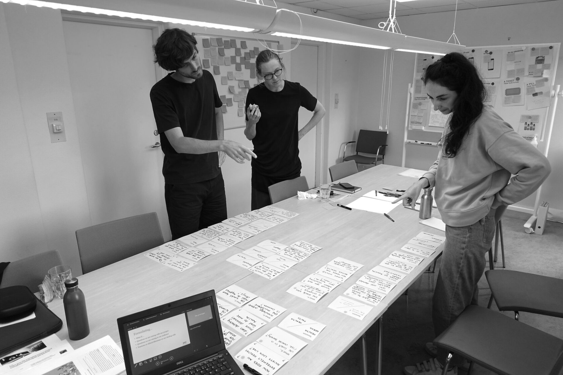
To translate our identified signals and trends into compelling future scenarios, we began by formulating thought-provoking “what if…” questions and envisioning their potential impact on individuals and society. Here are some of the questions that arose during our exploration: What if healthcare was proactive rather than reactive? What if we had the ability to predict health risks with exceptional precision? What if big data and algorithms fully formed the basis of our decision-making? What if dataism was the new religion? What if our society became completely risk-averse? What if healthcare prescriptions included lifestyle choices and behaviors? What if being unhealthy was treated as a crime?
We also delved into exploring the tensions, ethical dilemmas, and trade-offs that could potentially arise within these future scenarios. For example, we contemplated the trade-off between accessing superior healthcare at the cost of sacrificing privacy and freedom of choice. We also pondered philosophical questions, such as whether early screening and diagnosis lead to more sickness or better health and what it truly means to lead a healthy life.
The most challenging part was boiling down our thoughts to a concise set of key questions that would serve as the core focus of our project and effectively engage our audience.
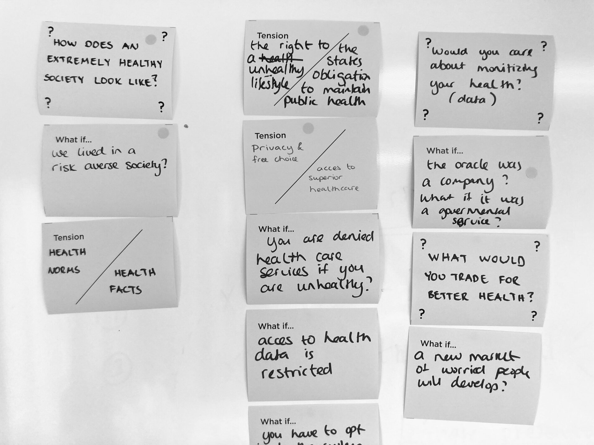
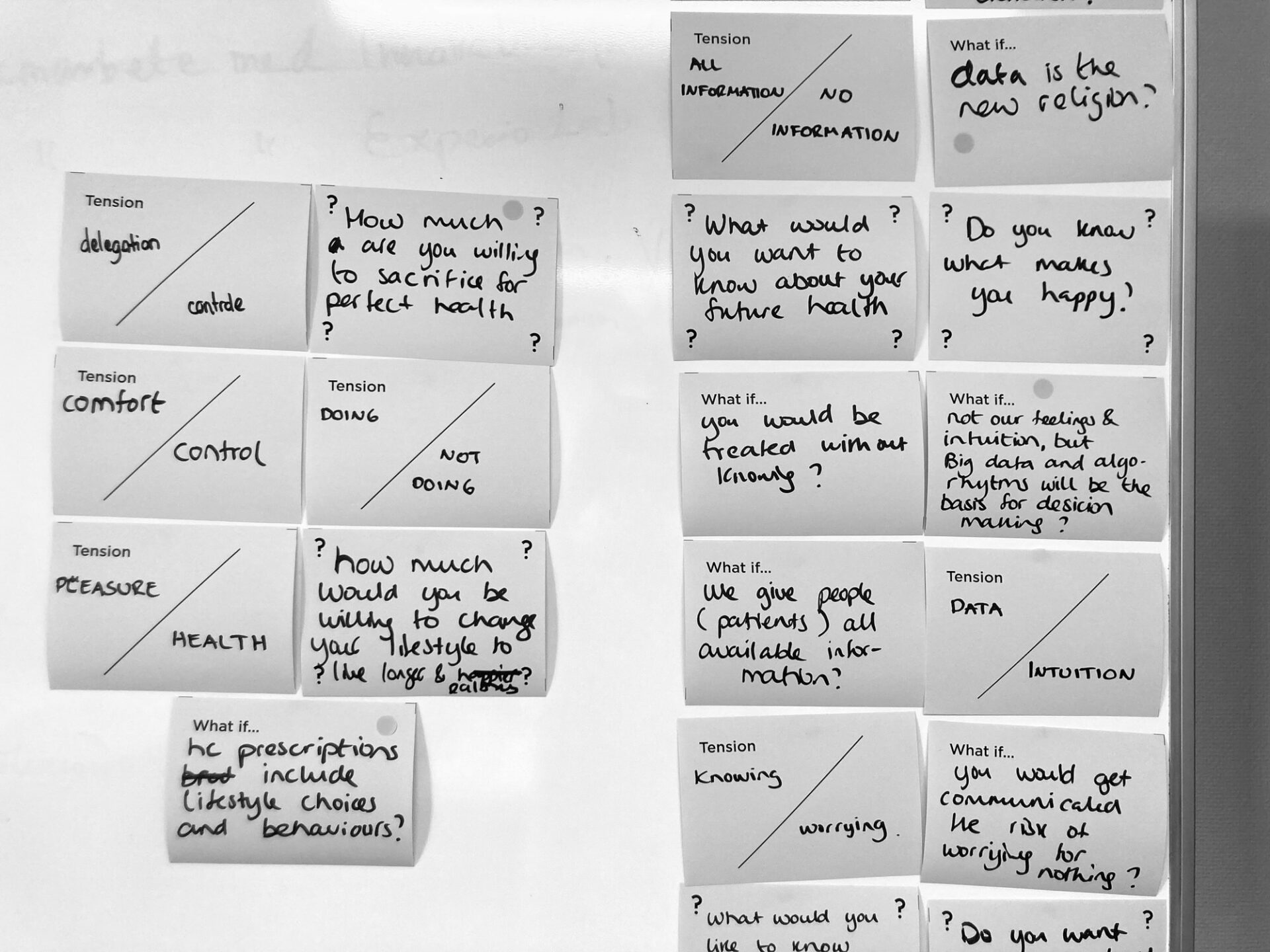
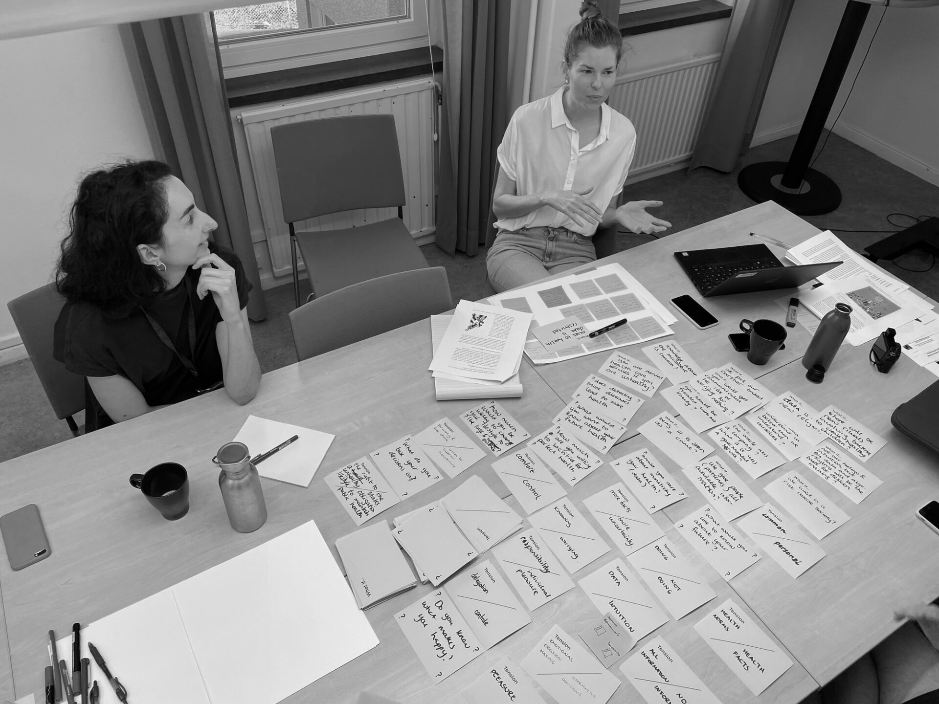
Hear Pomme tell us more about the questions we have explored in the project.
Creating future scenarios
Moving into the next phase of our process, we aimed to transform our identified signals into concrete future scenarios—short stories that vividly depicted how individuals would experience life in these imagined futures. Our goal was to create scenarios that were easily understandable and could be captured in just a sentence or two. This creative exercise generated a multitude of ideas for future services, products, and experiences. The concept of a Preventive Care Centre and a modern Oracle arose at some moment as a logical extension of our exploration and discussions.
Prototyping the experience
After establishing the overall narrative of the Preventive Care Centre, our focus shifted to creating an immersive and captivating experience for our visitors. We delved into the details of their journey by asking ourselves: What would be the first thing they see upon entering? What objects would hint at the future they’re stepping into? How could we transport them into this future? What words would greet them? What emotions did we want them to feel? What interactions would they go through? And what would they take away from the experience? What should they remember?
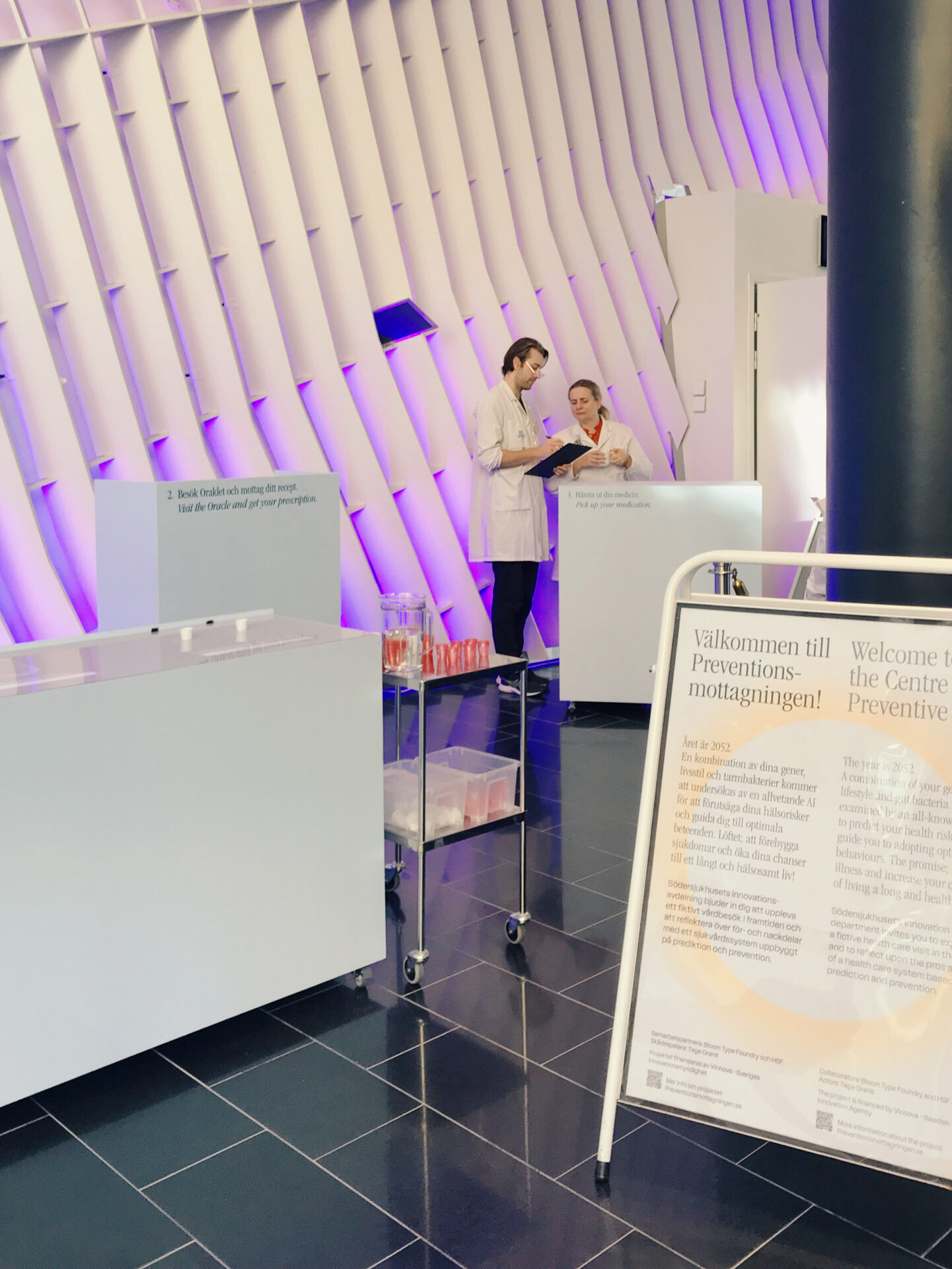
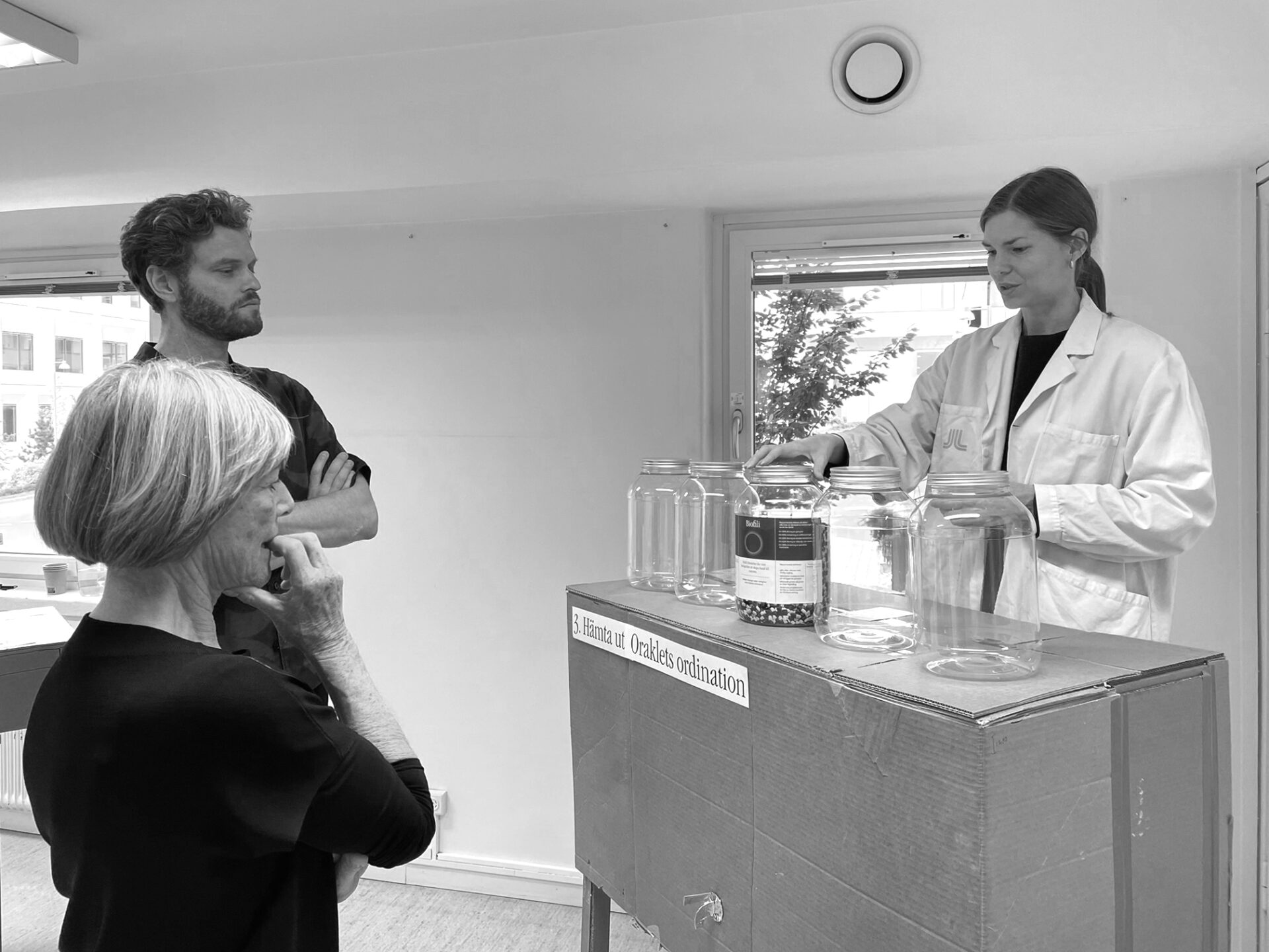
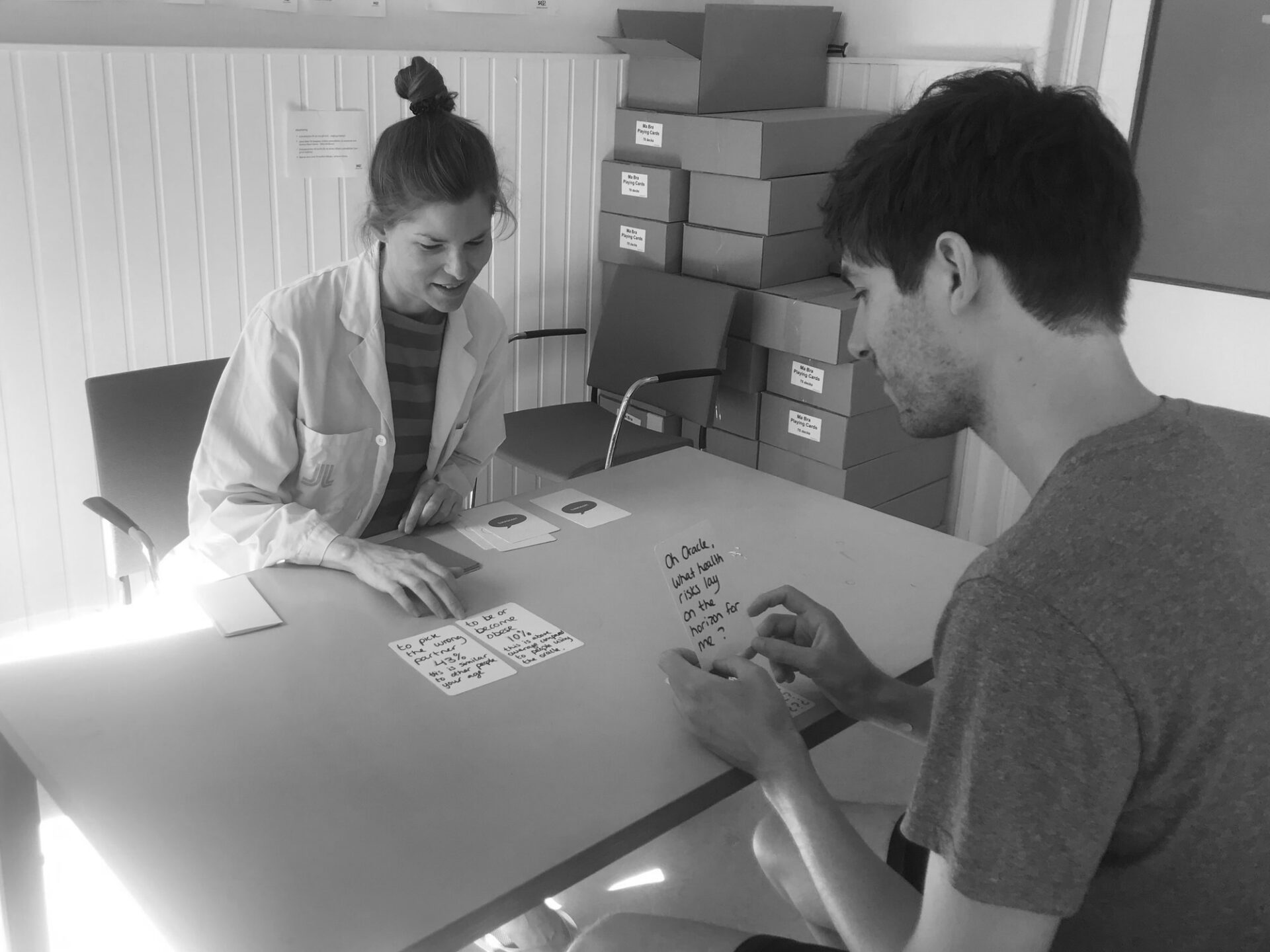
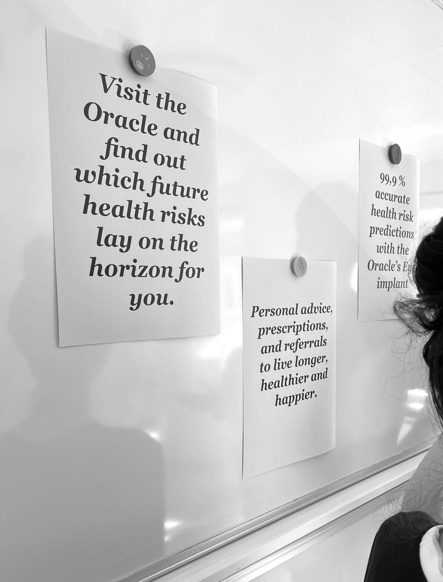
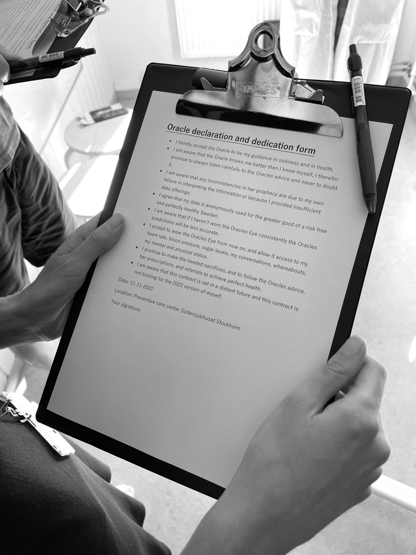
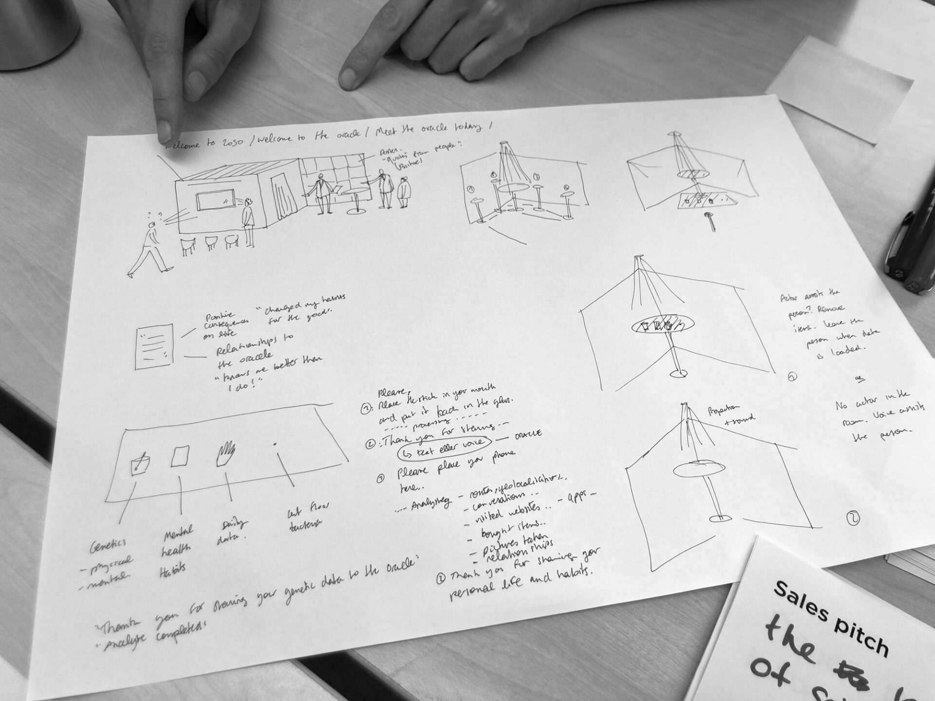
To tackle these questions, we created a simple analog prototype in just one day, focusing on the interactions from start to finish. The prototype included elements such as posters and marketing material promising a longer, healthier, and happier life. Visitors were welcomed by staff wearing lab coats, followed by a signing of a declaration form accepting an Oracle implant. There was a designated area for offerings like DNA samples, phones, and swallowable sensors. Visitors then had consultations with the Oracle, with one of our team members acting as the Oracle and others experiencing the encounter. The Oracle provided three predictions, accompanied by risk percentages and information on whether the risks were above or below average. Visitors were prompted to choose which risks they would commit to lowering and received corresponding prescriptions, which depicted envisioned future professions and treatments.
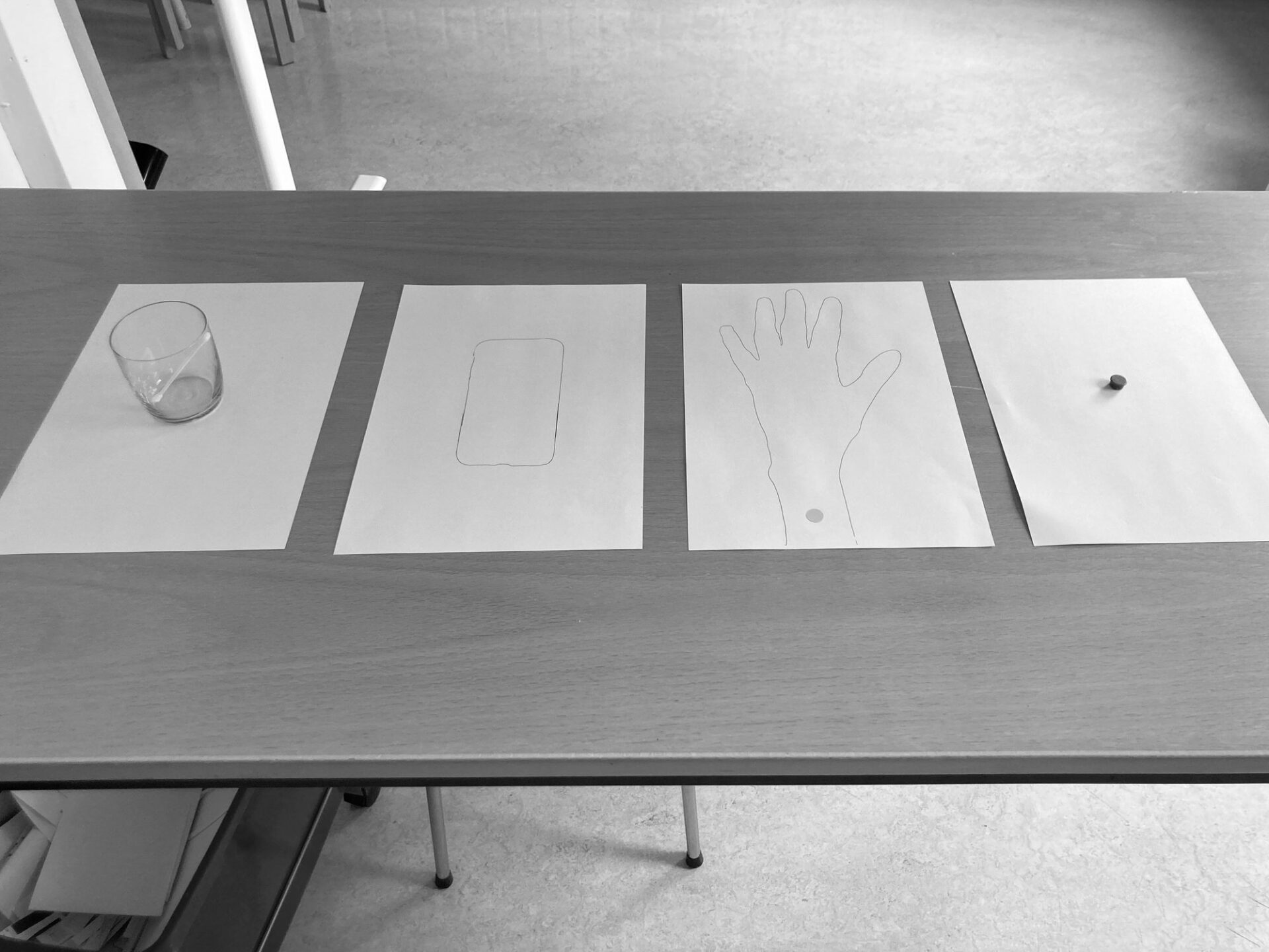
Crafting a thought-provoking future prototype
The simple prototype allowed us to swiftly identify what worked well, what didn’t, and which elements evoked powerful responses versus weak spots. It marked the beginning of an iterative process that spanned several months, during which we tested various versions of the experience, gradually approaching what we considered a well-designed future prototype, or design provocation as we also call it.
What makes a good future prototype you may wonder? Here are some key attributes to consider:
- It makes people think twice.
- It prompts individuals to envision themselves within a specific future.
- It leaves room for imagination and open interpretation.
- It incorporates tension or ethical dilemmas.
- It stimulates debates and discussions.
- It lies at the boundary of feasibility, challenging assumptions while remaining within reach.
When developing our prototype, we sought a future depiction that could encompass both positive and negative elements simultaneously, steering clear of a strictly utopian or dystopian narrative. Throughout the design process, we always kept in mind the purpose of our prototype: to stimulate reflection on current developments and ignite a debate about the pros and cons of predictive and preventative healthcare.
Testing
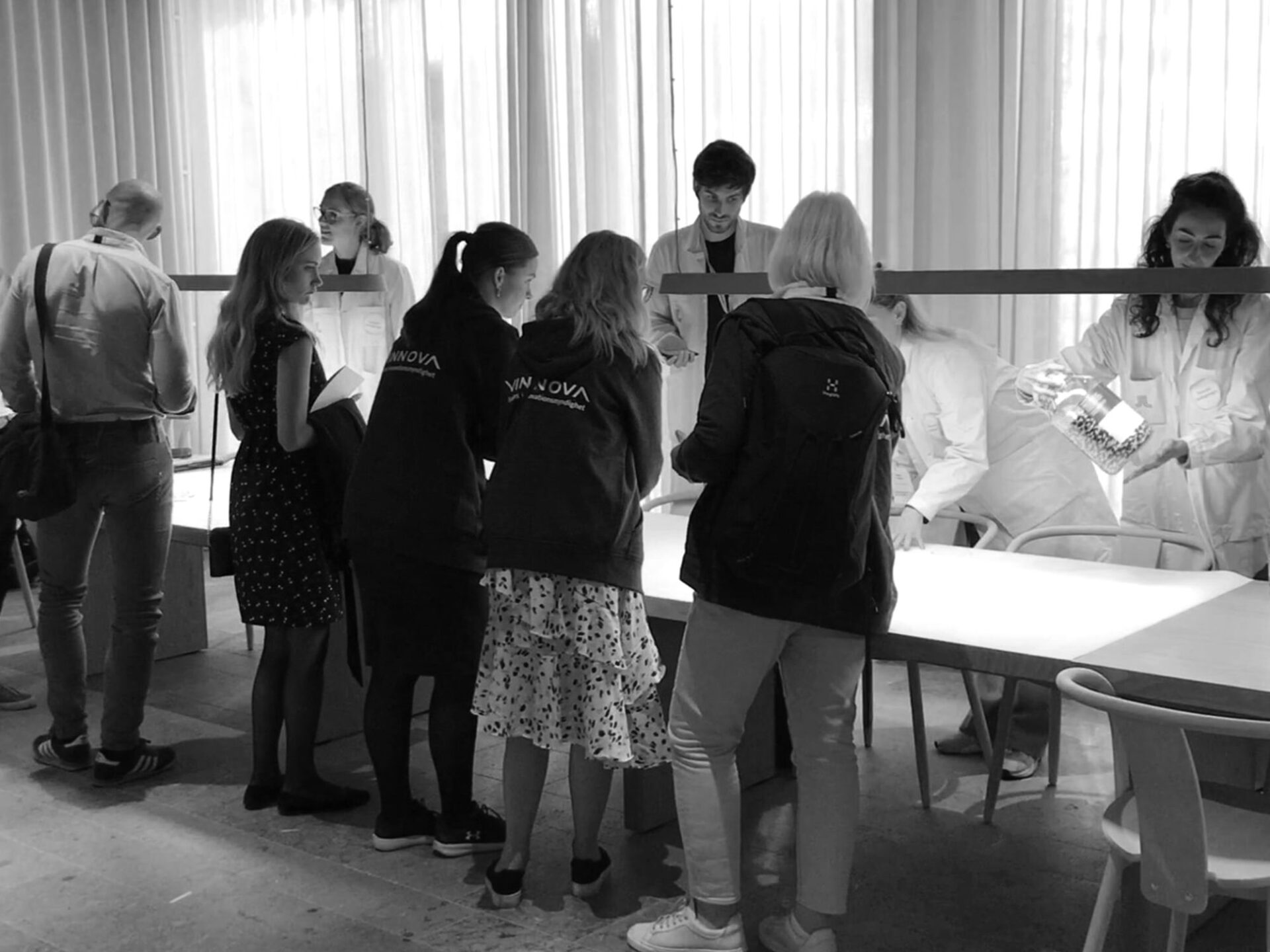
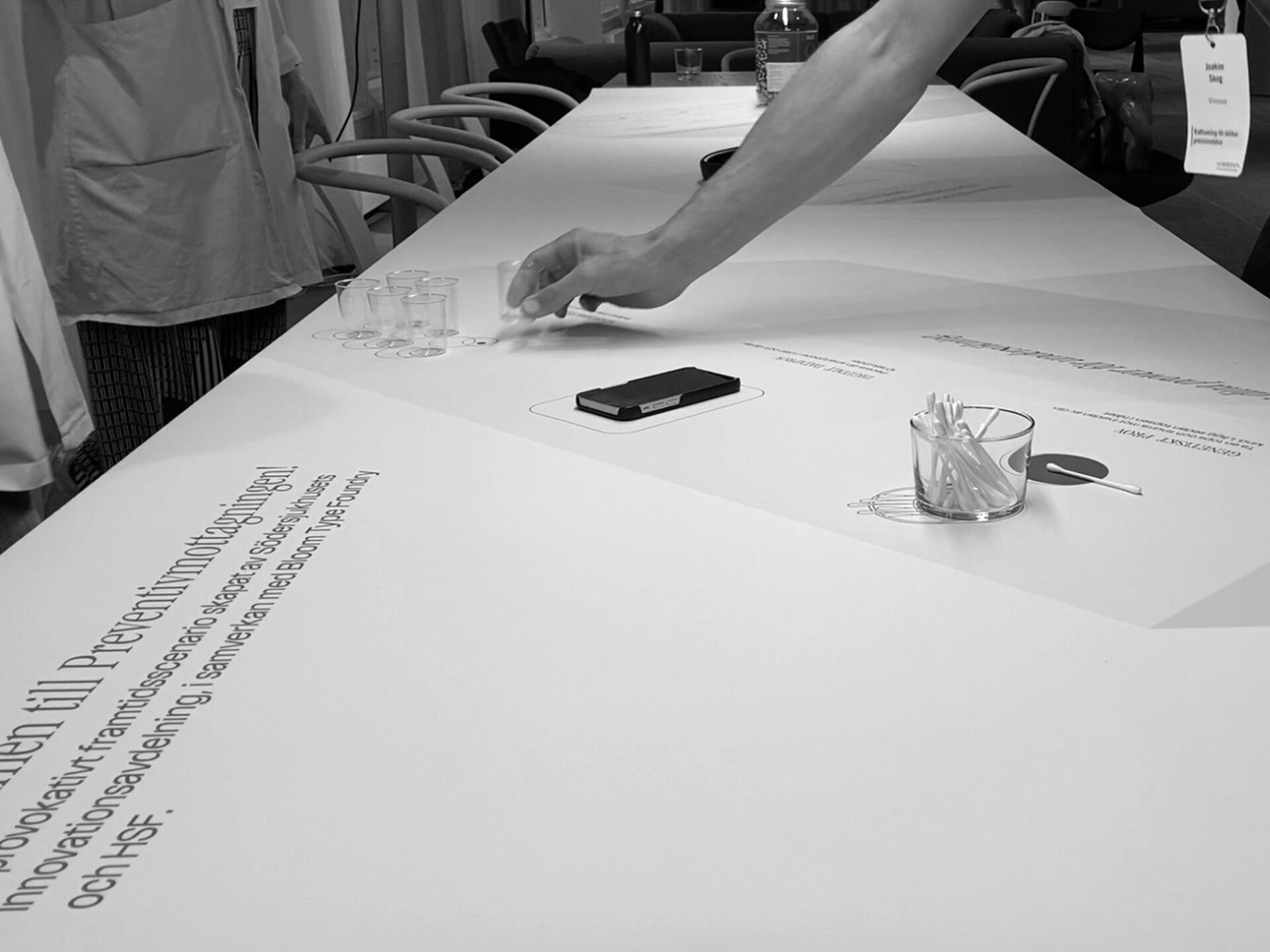
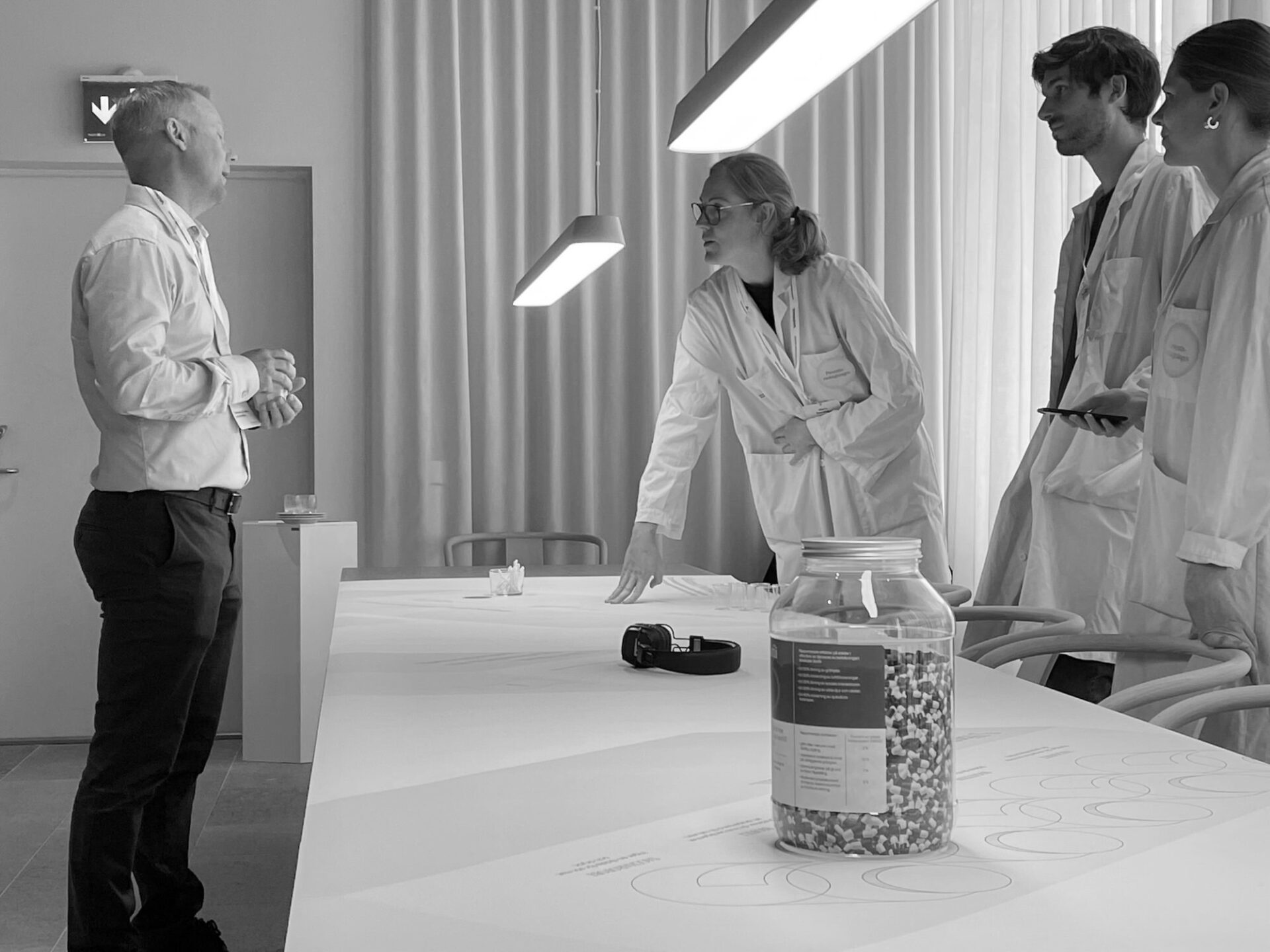
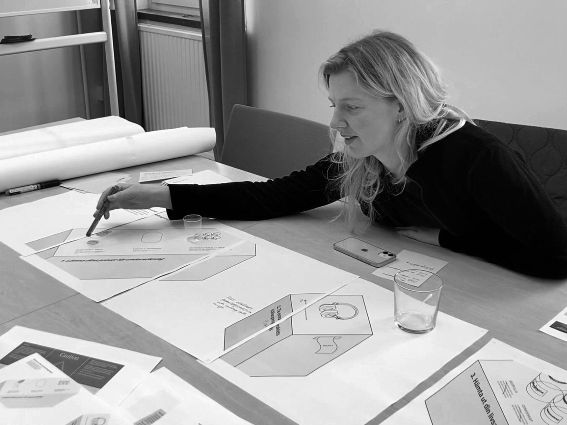
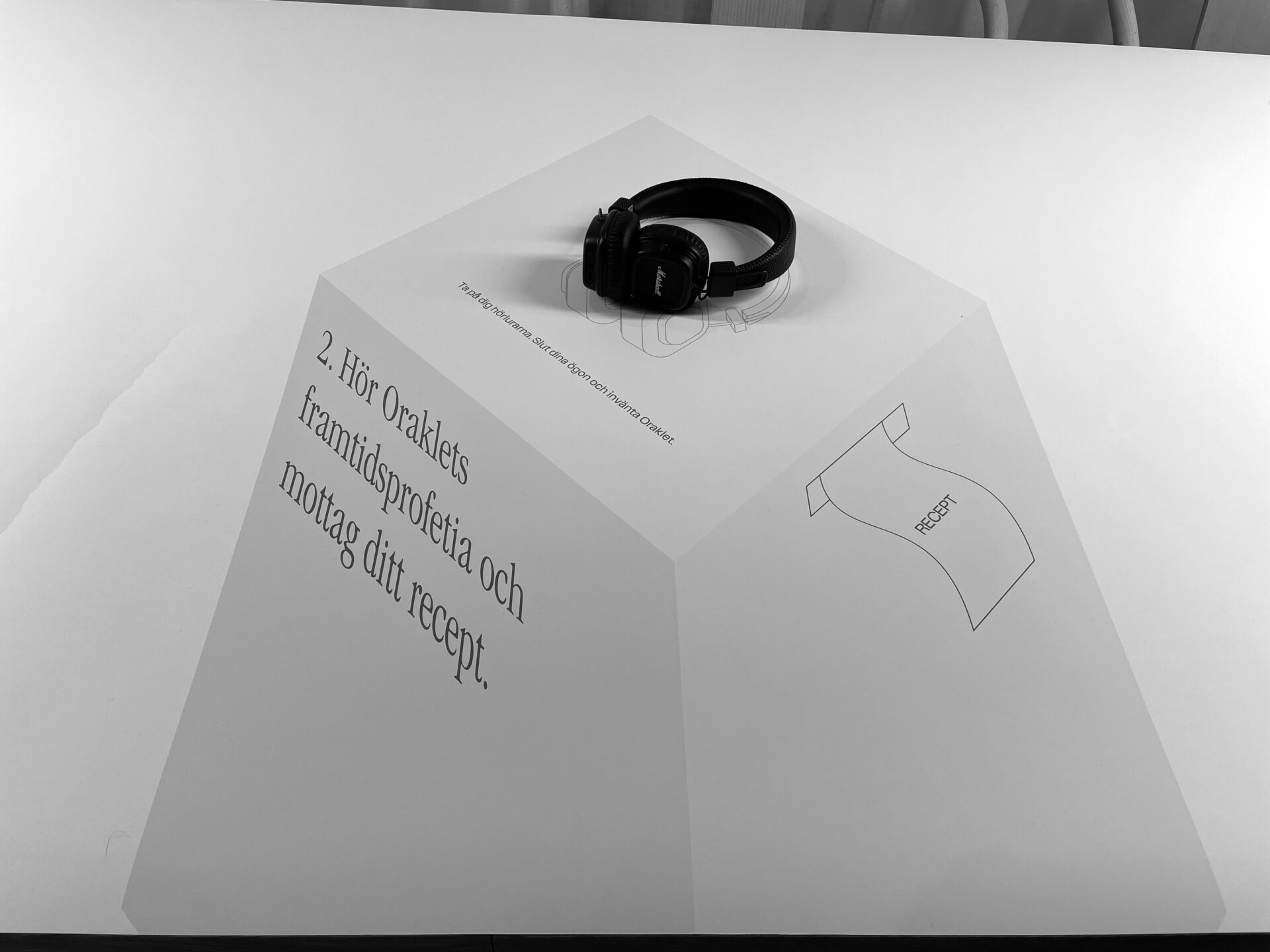
As we progressed further in the process and finalized the key interactions and setup of our installation, we seized the opportunity to test our prototype on the audience of a precision medicine conference organized by Vinnova. To facilitate this testing, we created a large poster featuring isometric drawings of the installation, allowing people to visually walk through it and engage with the various stations. Participants were invited to place their phones on a designated square, listen to the Oracle’s voice through headphones, and explore the pill pots at the pharmacy station.
Through this engagement with the conference audience, we gained valuable insights into their responses and the thoughts and discussions that were sparked by our prototype. These learnings played a crucial role in shaping our design decisions and refining the overall experience as we moved forward.
The installation
During the design process, we drew inspiration from the Oracle in Greek mythology and explored ancient prophecies, pilgrimages, rites, and rituals to inform our design decisions. We played with the concept of data as a new form of religion (Dataism) and envisioned the sampling station as an altar where offerings were brought, with the Oracle providing mystical insights and dispensing symbolic elements like hosties or wine.
Early sketches of the exhibition structure and materialization leaned towards a stronger resemblance to ancient Greek temples. However, as we distilled the essence of the project, we opted for a more minimalistic installation design to ensure it wouldn’t distract from the interactions and to maintain a clear narrative for the audience.
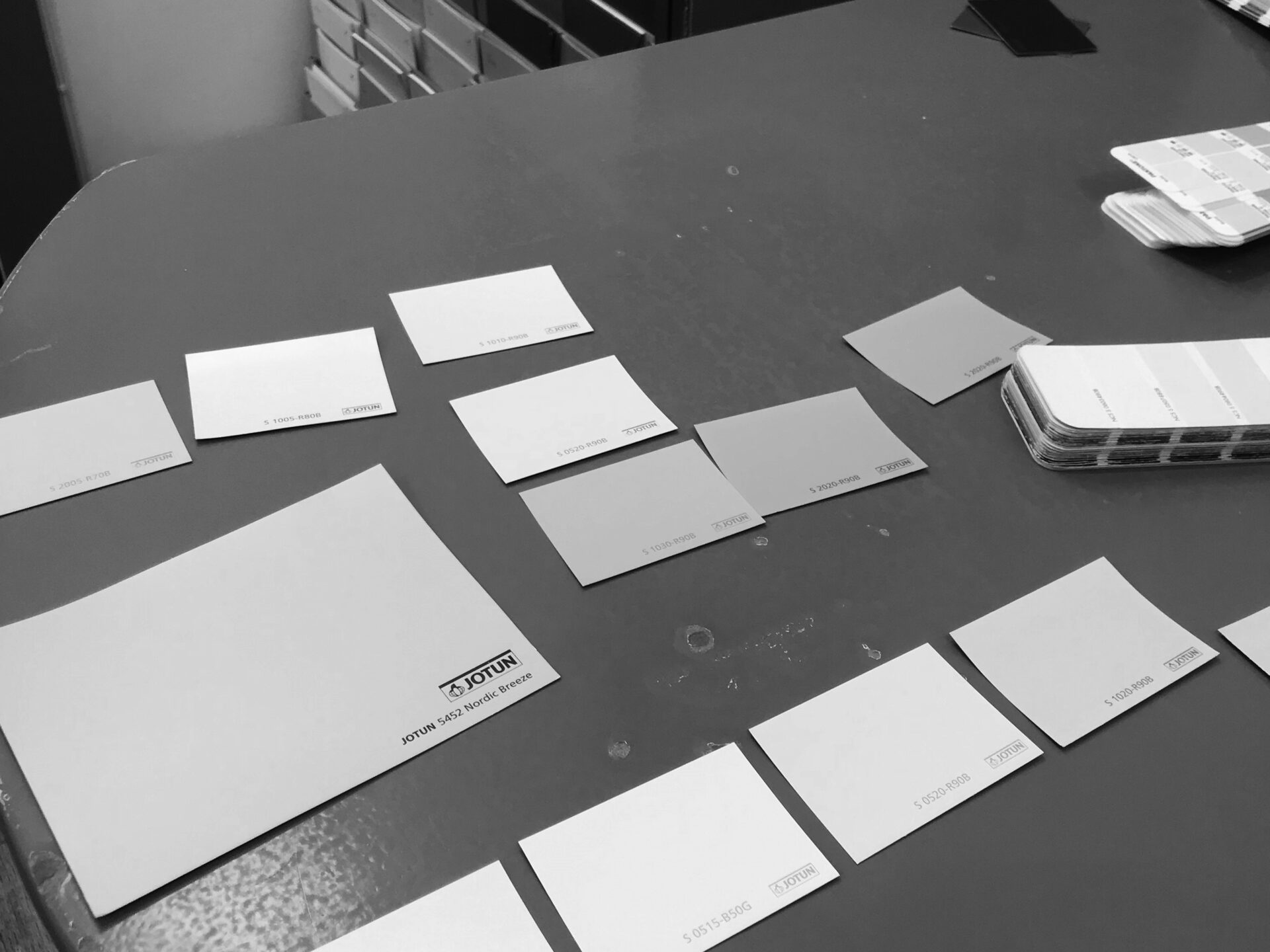
Considering that the installation would be located in the main entrance of the hospital, we aimed for aesthetic cohesion with healthcare and medicine, tapping into people’s associations. Simultaneously, it needed to stand out and convey the notion of a staged future. The design incorporated deliberate details such as the use of bright, cold colors, white lab coats, giant pill pots, swallowable sensors, carefully crafted labels, and the pharmacist positioned slightly higher than the visitors. These elements aimed to strike a balance between authority and a touch of theatricality, evoking a slightly unsettling yet immersive experience.
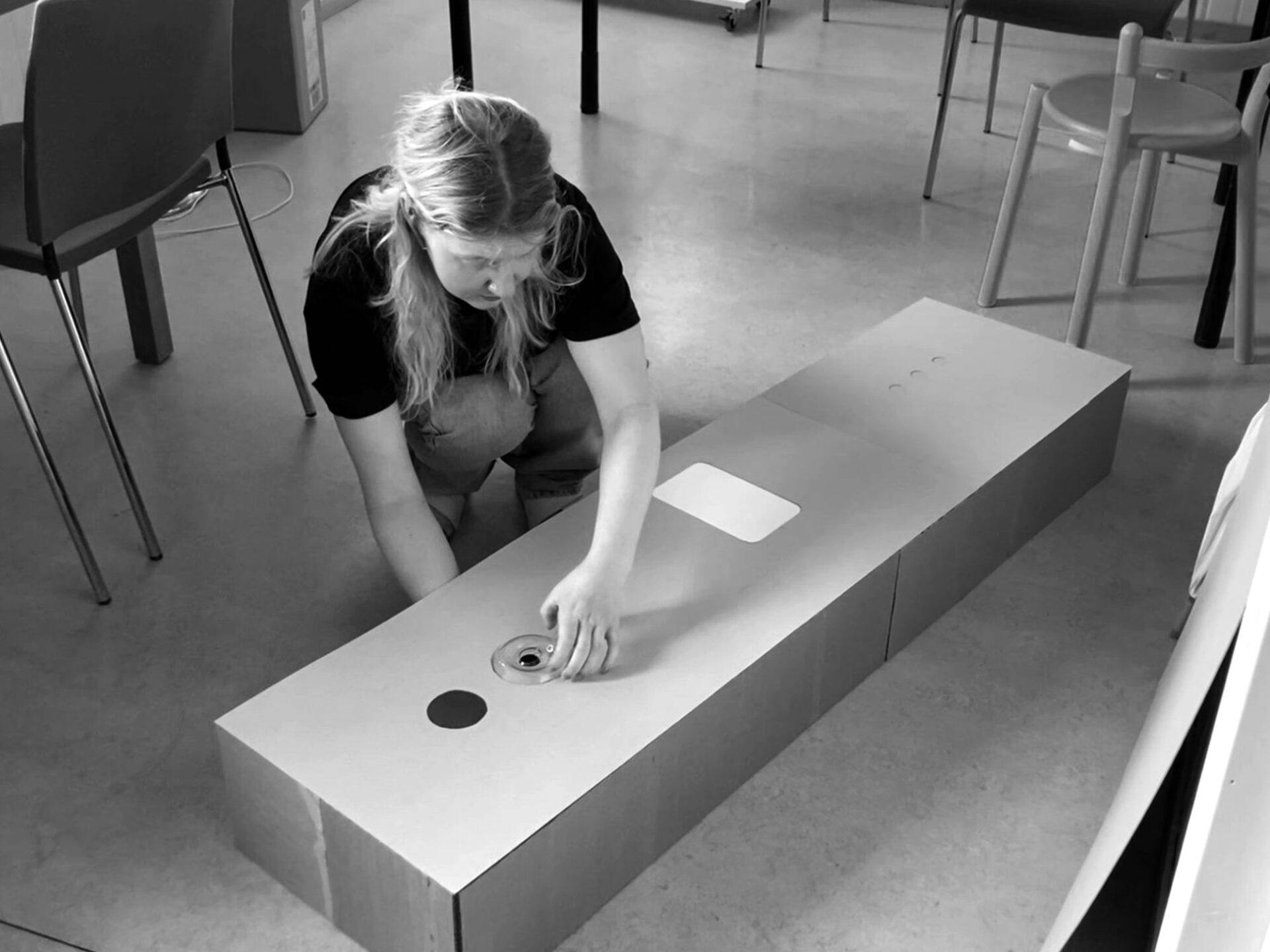
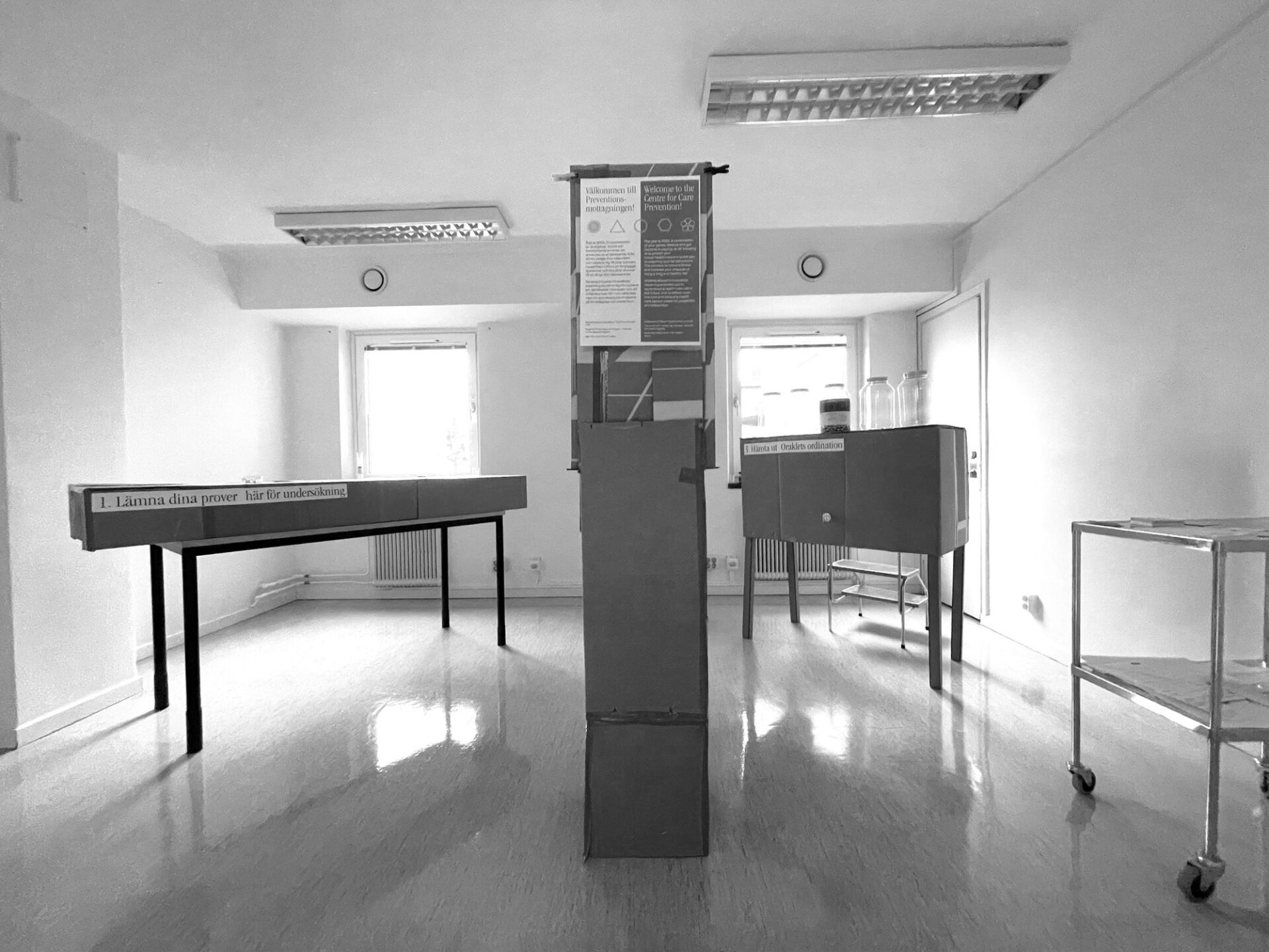
Designing the exhibition structure went hand in hand with determining the interactions, props, and technology involved. Practical considerations such as budget, available space, fire safety regulations, and the need for nightly storage and mobility also factored into the decision-making process. We created multiple 1:1 cardboard prototypes to test and refine the setup, ensuring the best possible configuration for the exhibition. In the end we send the technical drawings to in-house carpenters who build and painted the stations.
The Oracle
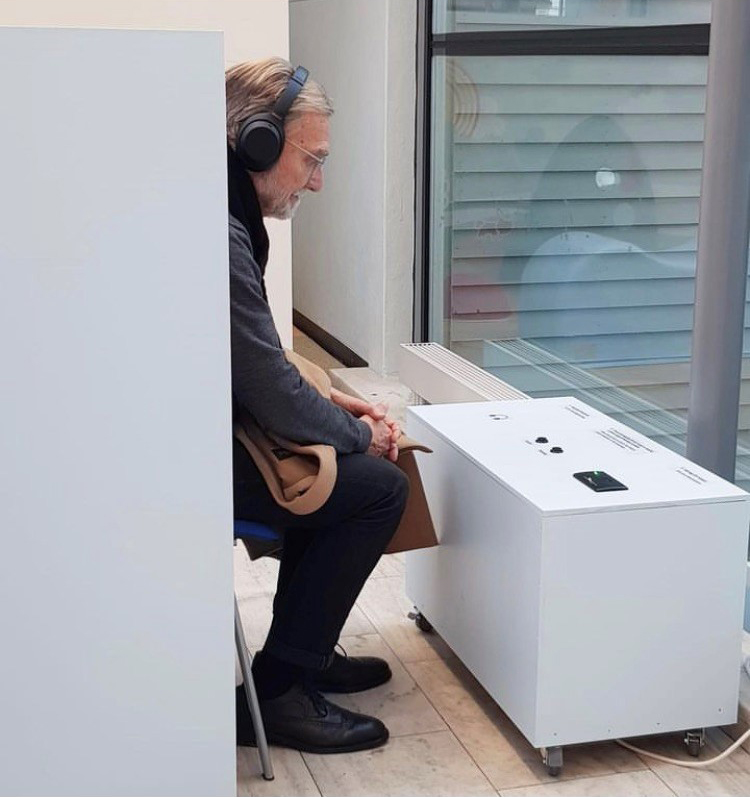
A big question from the start was what exactly the Oracle would tell people and how she would appear. We discussed whether she should be seen, felt, or just heard, and whether her messages should sound scientific – communicating numbers and risk percentages – or more mysterious and cryptic – resembling ancient prophecies with their ambiguity and three-sentence structure. To maintain some of her mystique, we decided that she would appear only as a voice and kept some of the cryptic nature of the messages while still communicating a clear prediction and a call for action.
Initially, we only recorded the Oracle’s health prediction. During testing, we realized that people needed more time to get used to the Oracle’s voice in order to pay attention to the important part. We added more content to the script to introduce the Oracle and explain what she was about to reveal. We used a text-to-speech program for the recordings but would have used real voice actors if time and budget had allowed it.
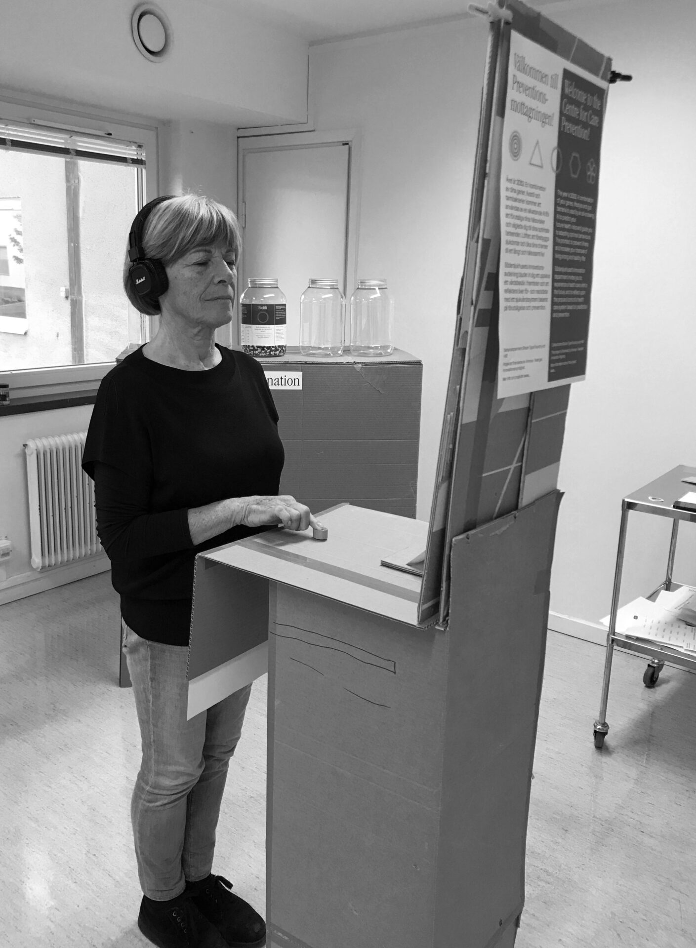
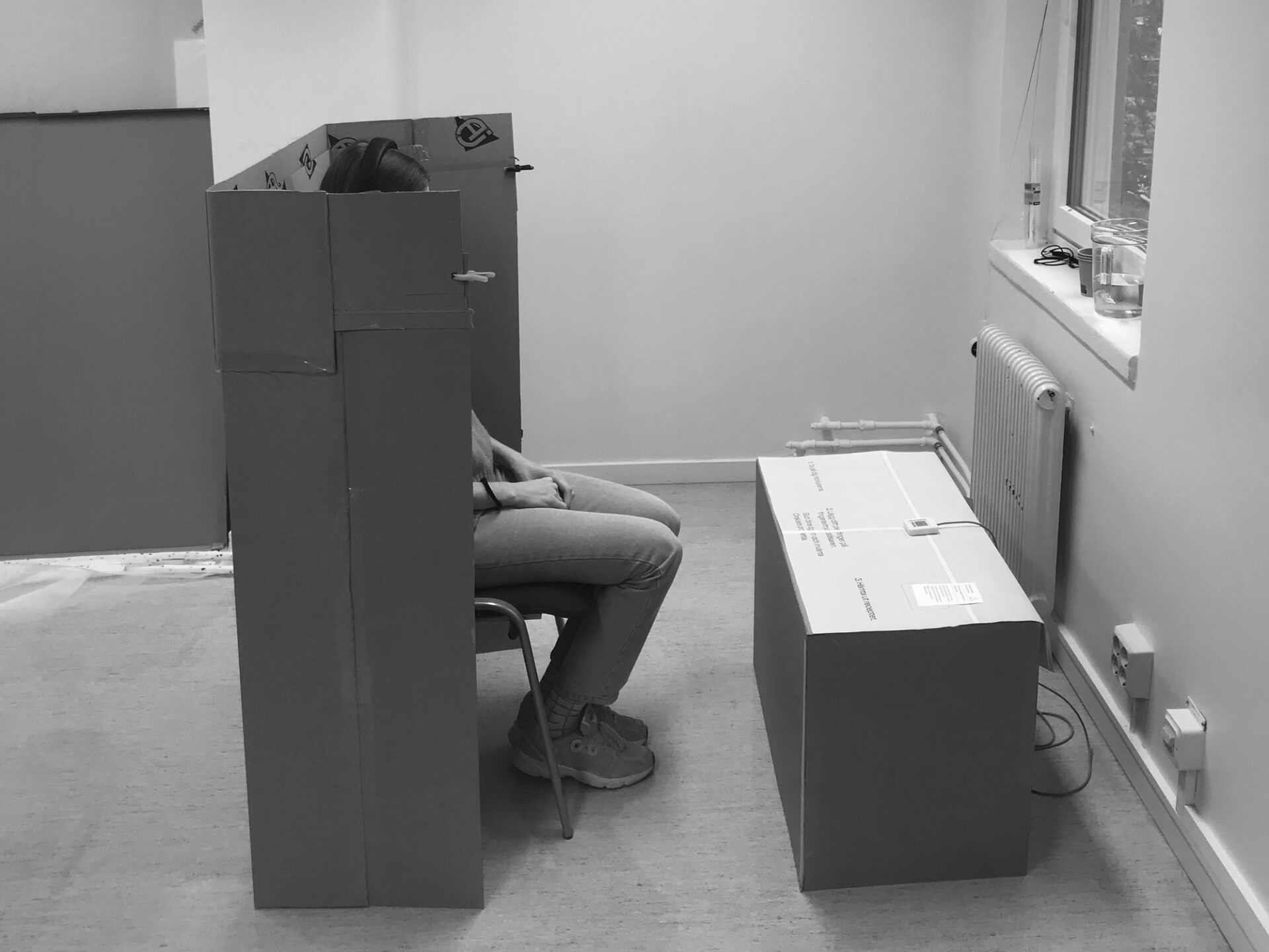
Another question was how people would listen to the Oracle’s voice. Did we want this to be an individual activity, or should others be able to listen in? Would we create a booth with a speaker or a more intimate seating area with headphones? In an early prototype, listeners stood beside a terminal while listening and felt too exposed and distracted. This led us to design the partially enclosed booth in which people can focus on listening while it’s possible for others to see that the station is occupied, avoiding the next person from going in and disturbing the experience.
Selecting which health issues the Oracle would address was another challenge. We conducted extensive research on health factors linked to genetics, lifestyle, and the microbiome. Given that our exhibition would be set within an actual hospital and the Oracle’s messages might have a real impact on people (even if they would rationally know it was fiction), we were cautious not to address emotionally distressing conditions such as cancer.
The Oracle’s messages were designed to function similarly to horoscopes, resonating differently with various individuals. We aimed to create messages that evoked genuine emotions without causing upset. Additionally, our goal was to broaden people’s awareness of lesser-known health facts and threats. For instance, we explored how genes could influence sugar cravings, the impact of loneliness on lifespan, and the strong connection between mental health and gut health. After writing numerous Oracle messages, we selected the 15 most engaging ones for the experience.
The Pills
It was only until rather late in the process that we came to the idea of ending the experience with a behavior changing medicine. We initially considered a technological solution, such as an implant to track behavior and provide constraints or suggestions. However, this felt like a more familiar narrative and lacked immediate impact. We also considered an actor providing personal consultations on how to follow up on the Oracles advice, but that seemed very time-intensive and too personal.
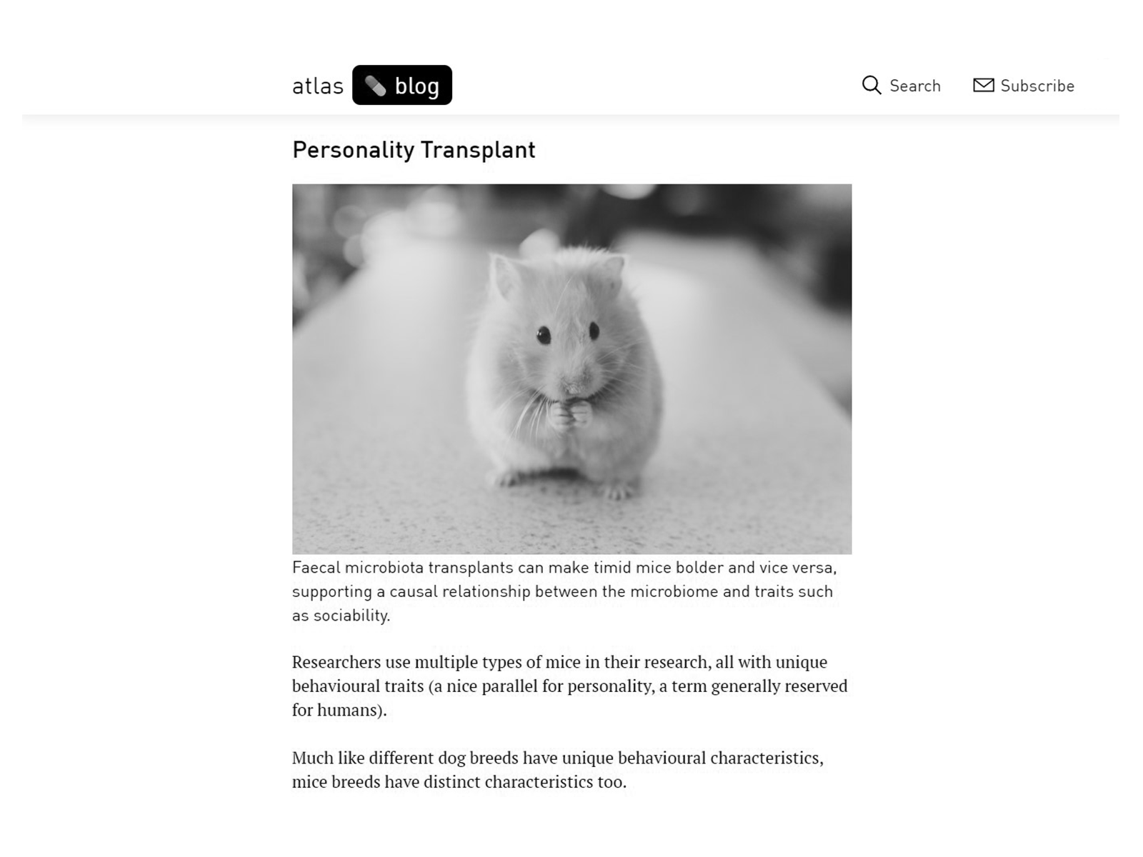
Eventually, it was our research into social prescribing, the power of placebo pills and reports on gut transplantation changing personality, that led us to the idea of a pill to complete the experience. We considered the concept of a behavior changing pill surprising, thought provoking, and it would allow participants to experience the placebo effect in real-time.
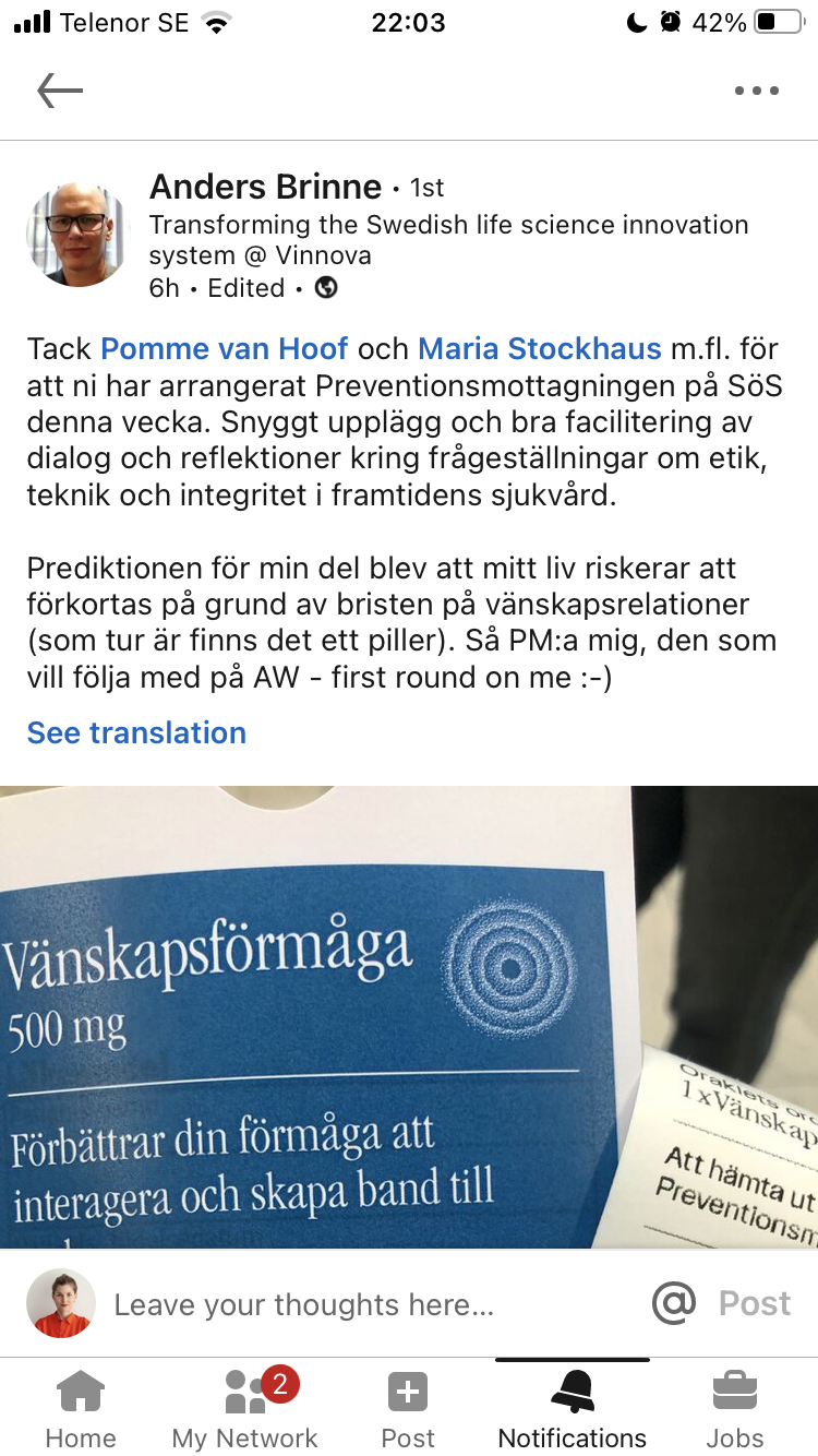
Initially, participants were asked to take the medication on the spot, but this clashed with the swallowable sensor at the sampling station. As a solution, we provided small medicine bags for participants to take home, serving as a memento, offering project information, and acting as conversation starters among participants.
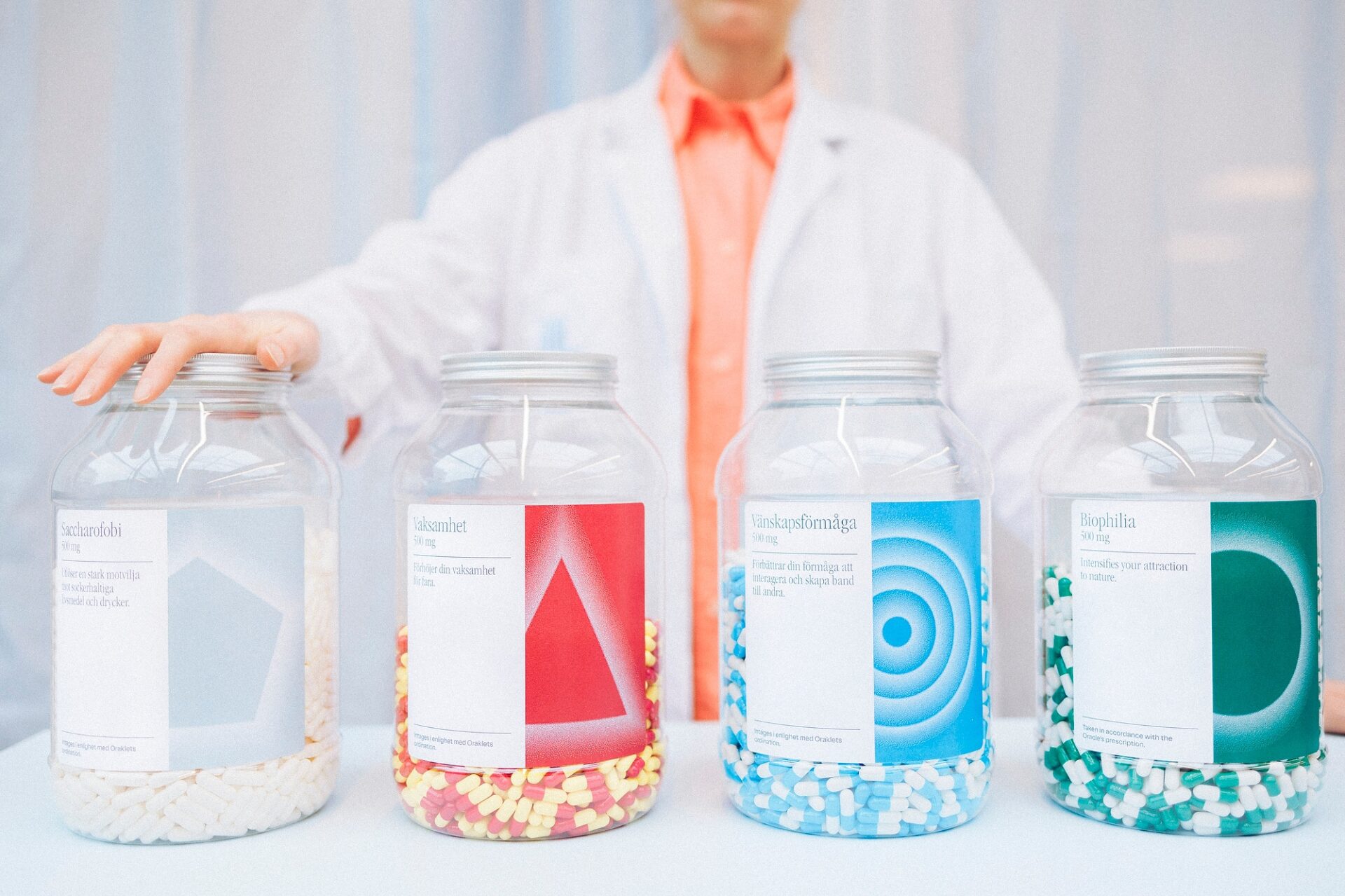
The early versions of the pill pots included extensive lists of side effects, but to maintain simplicity, we decided to describe the medication’s functionality in a single sentence.
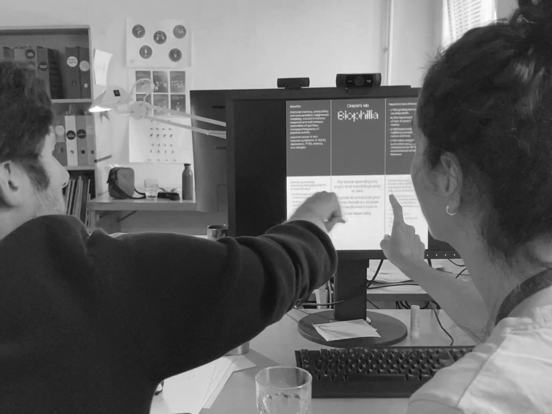
The pill labels were carefully designed to fit the aesthetics we envisioned. It had to resemble contemporary pharmaceutical labels so people could recognize it as such. Therefore, we used minimalist layouts, distinct colors, and geometric shapes associated with each medication, such as a circular shape reminiscent of a planet or a sun for Biophilia. Subtle bitmap diffused effects added a pinch of mystery, magic, and power. The typeface Knapp, a sans serif with a corporate and techy touch, combined with the typeface ITC Garamond condensed, a stretched serif with a science fiction tone, gave the final touch to the design of the pill labels.
Technology
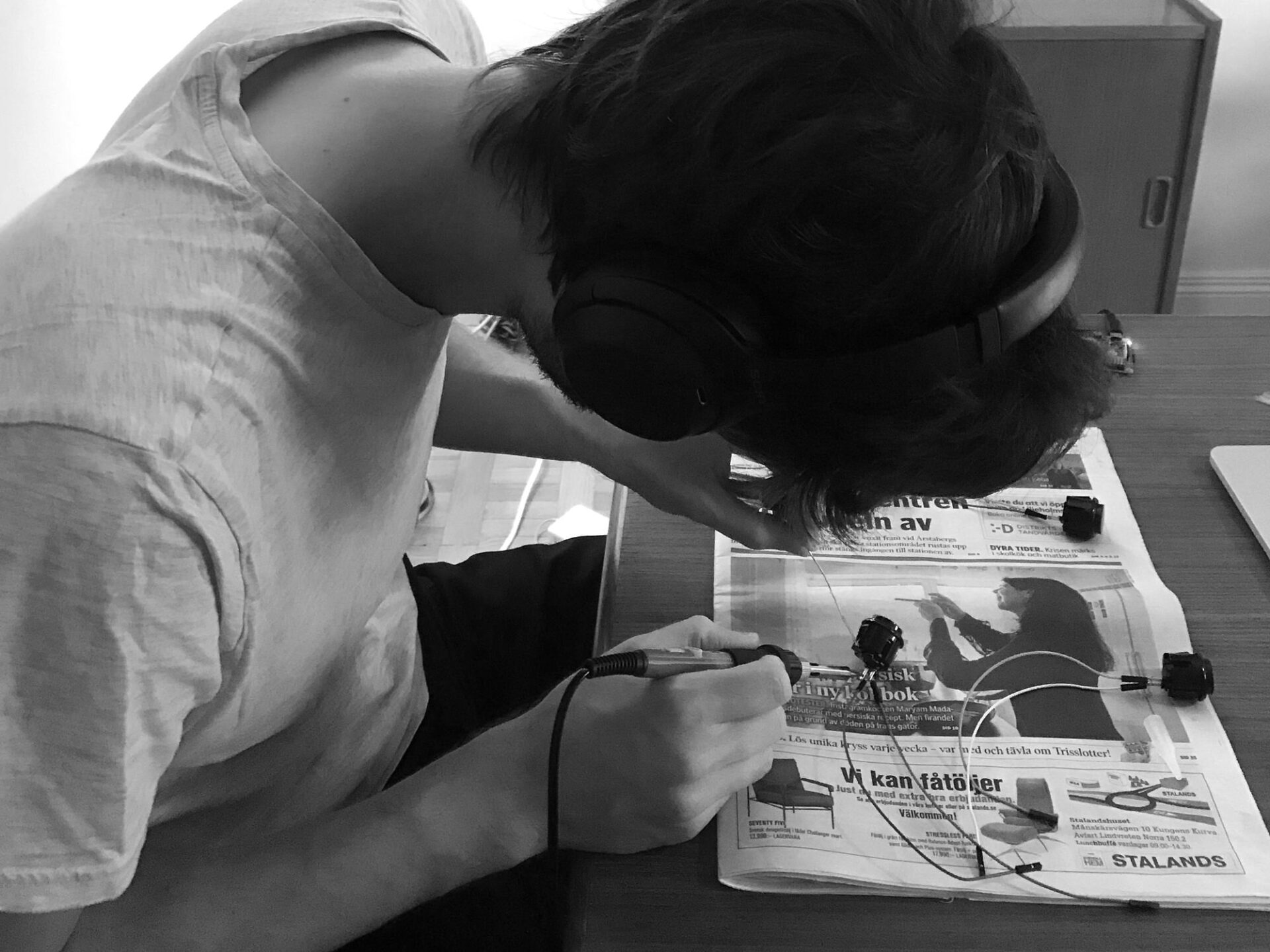
Two out of the three stations in our installation incorporated technology, with the first station, where participants left their samples, being the most complex. This interactive station had to detect when someone placed their DNA test stick, phone, and took the swallowable sensor off the table, and provide immediate written feedback. It also had to accommodate multiple people simultaneously to prevent bottlenecks.
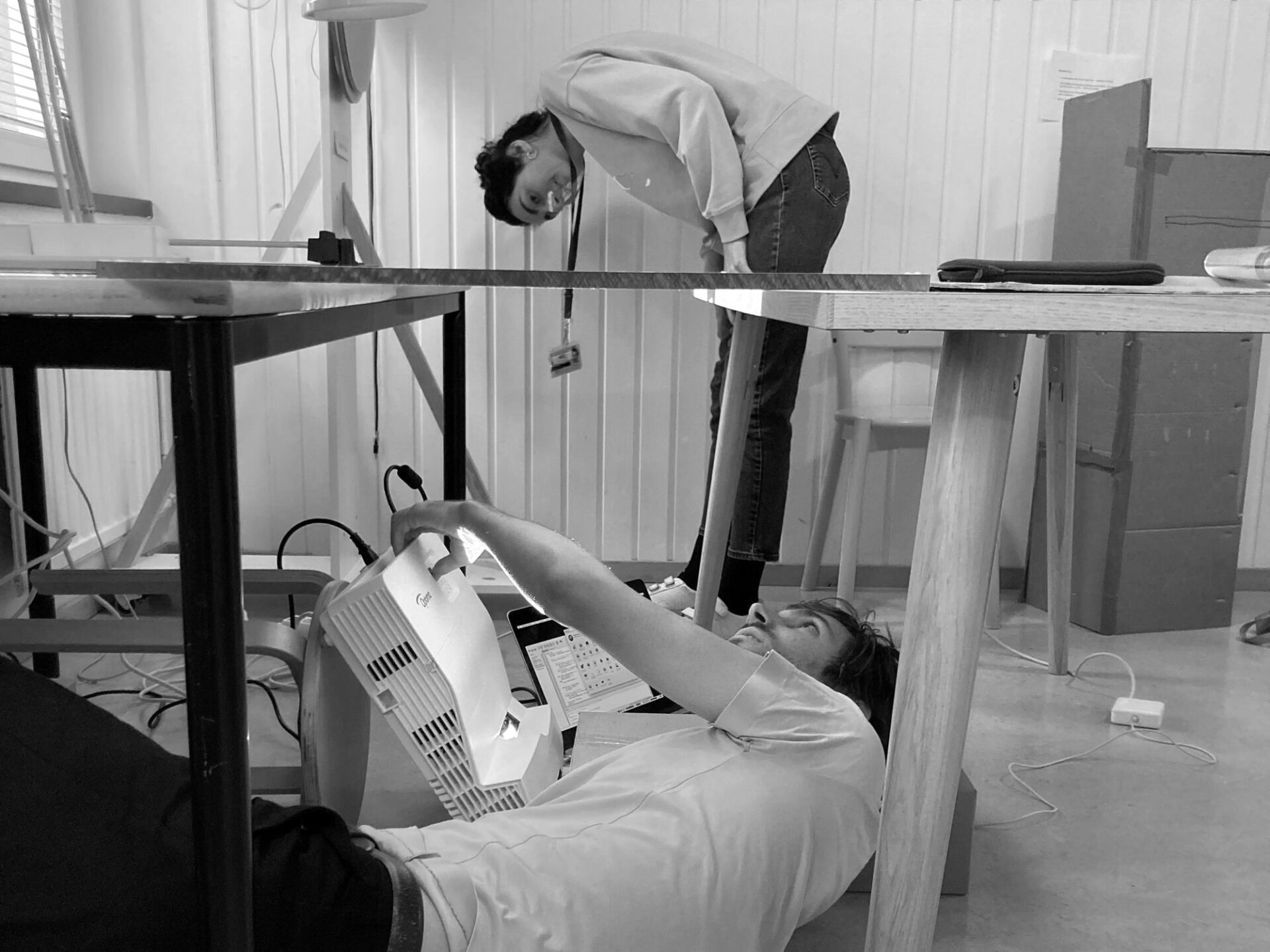
We needed a hole in the surface for collecting the DNA samples, ruling out the use of a regular screen or touchscreen. Additionally, the table would be placed in varying lighting conditions, including direct sunlight and different levels of artificial light. We therefore needed a solution that could output sufficient light, was compact and quiet. The information on the table also needed to be visible from different angles, including directly above, matching the table’s projection angle. It also had to be strong enough to sustain itself over the rather long length and hold when people would potentially lean on it. After experimenting with several materials like blurred plastic, PVC, acrylic in various colors, we settled on a sandwich structure consisting of two different plastics, with white industrial static protection plastic serving as the projection surface.
Then we needed sensors to detect the presence, or absence, of objects on the table. We explored the use of video stream detection from the inside. The main problem with this idea was that the surface of detection was also the surface of projection, leading to reading errors. After several tests with different types of sensors, the final choice was to incorporate both infrared distance sensors into the sides of the table and one video image detection. These independent sensors were connected to microchip controller boards (RPI pico) reporting to a central MQTT server (a small board computer, RPI 4) inside the table. The same server was used to process the video signal using OpenCV, powering a small web server and projecting the interface on the table using a web client with HTML and JS.
The second station, the Oracle, also incorporated technology. It consisted of a box enclosing a single-board computer (RPI 3) connected to 2 buttons, a digital thermo-printer, and Bluetooth headphones.
Each button was linked to a different language (English and Swedish). The single-board computer was programmed to deliver different audio prophecies to each participant and print a prescription ticket after the audio message. The Oracle was designed to ensure that each prophecy and prescription would be given in a unique randomized manner while keeping prophecy messages as far apart as possible from each other in time. This meant that even though there were 15 different prophecies, in no large group would two individuals receive the exact same one, giving it a sense of uniqueness.
Questions to pose our audience
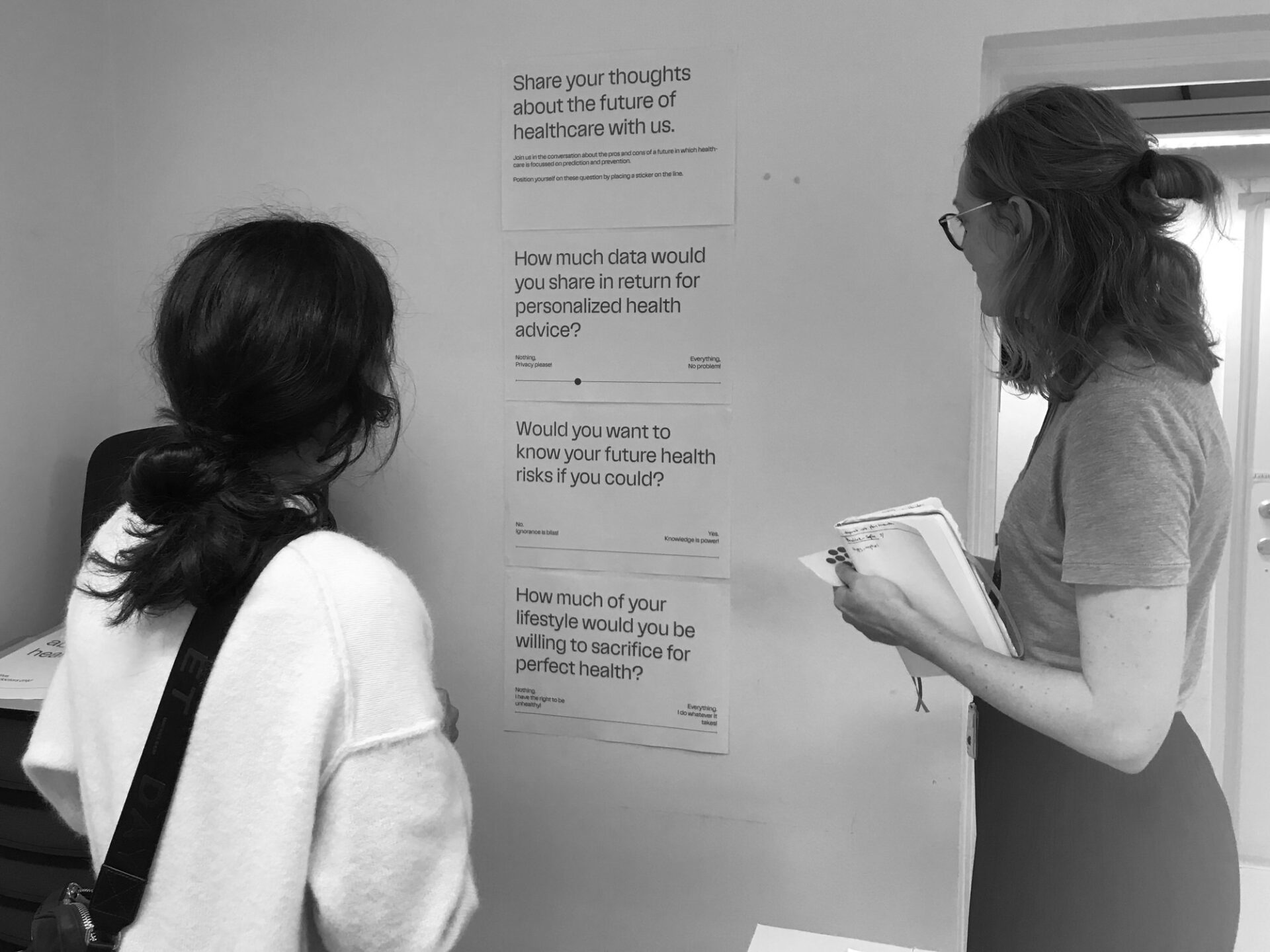
The ultimate goal of the prototype was to stimulate a thought-provoking debate. We aimed to guide people in imagining a potential future of healthcare, encourage them to reflect on the advantages and disadvantages of predictive and preventive medicine, and to trigger discussions about the direction we want to be heading and what we should be mindful of.
Rather than assuming this process of reflection and dialogue would spontaneously happen, we tried to carefully design it. We provided our visitors with key questions at the end of their visit. We had to come up with good thought-provoking questions that related to the experience in the installation, and we had to find a fitting way to present them. After crafting various questions, we boiled it down to four. Initially we considered using Mentimeter for visitors to jot down their thoughts, collect responses, and display them in real time. However, we choose not to do this for several reasons. It would require yet more instructions for the visitor who just navigated a content rich experience, we would need more screens to place somewhere in an already confined space, and it might disrupt the flow of the experience. Instead, we settled on a simpler format; engaging visitors in a dialogue with us and fellow visitors prompted by questions on a poster, inviting people to take a stand on given topics. We felt the need to pick between data collection and providing visitors with an optimal experience and we prioritized the latter. Instead, we choose to capture some of our visitors’ reactions on film, allowing us to show the broad spectrum of thoughts and insights the experience could evoke.
Showtime arrives
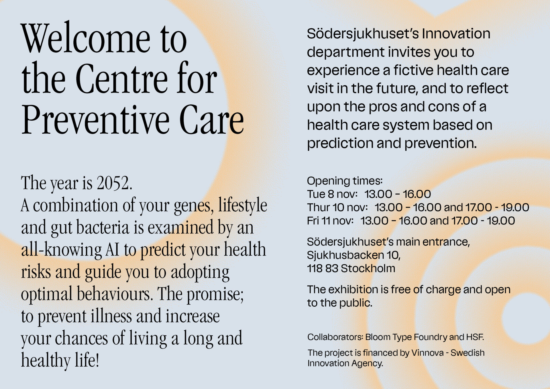
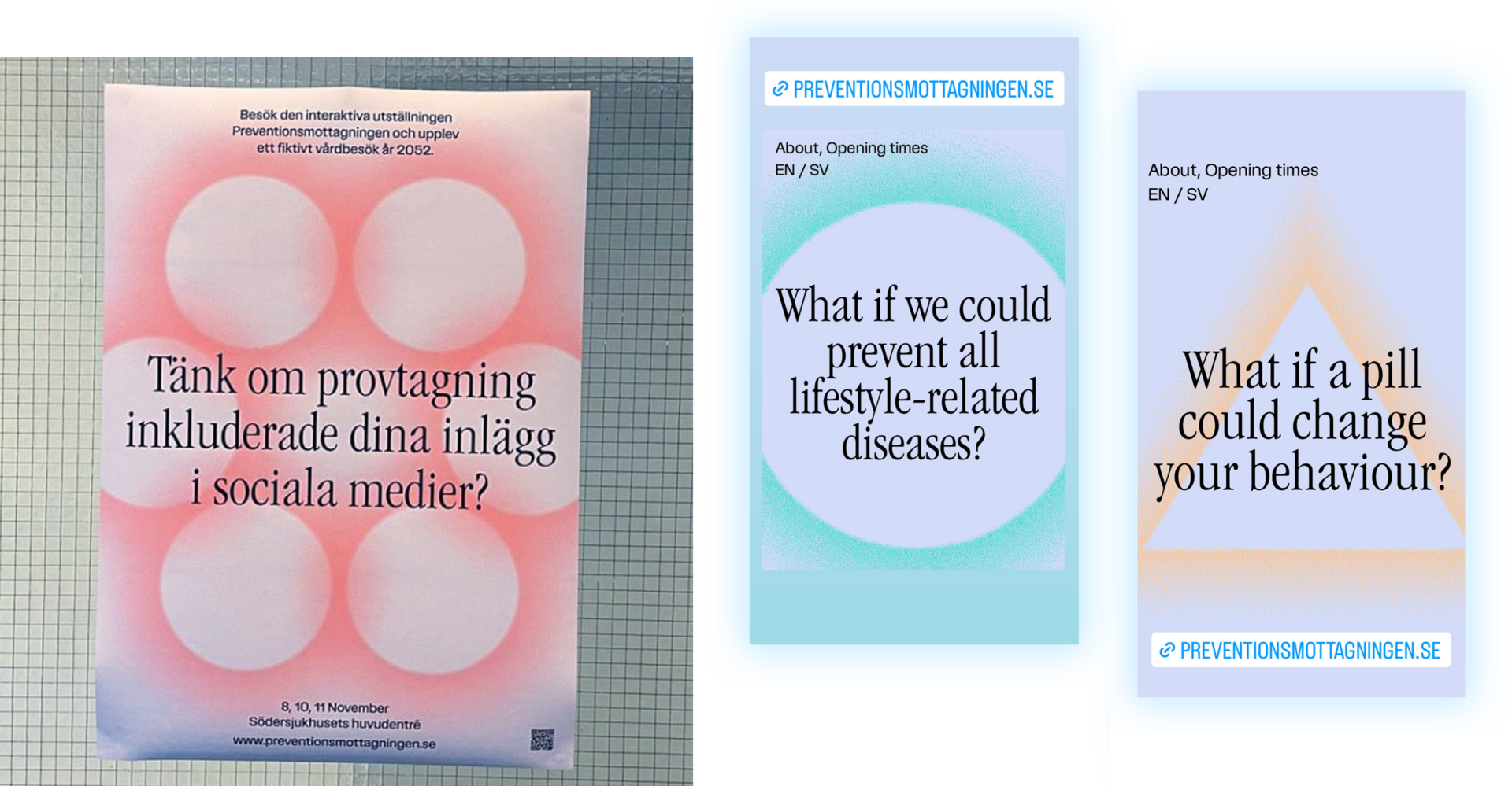
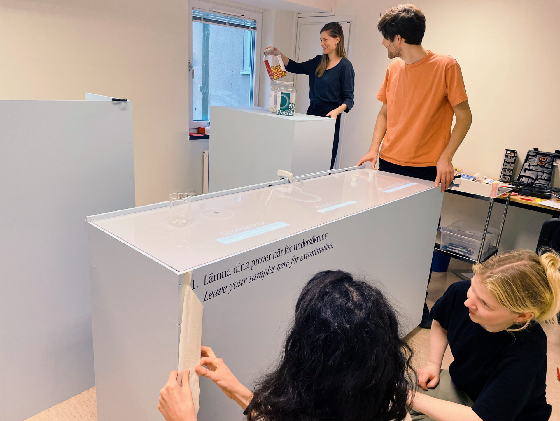
The final weeks leading up to the opening, our efforts were focused on ensuring the technology to function, sending out press releases and invitations, placing posters throughout the hospital, filling countless transparent capsules with sensors (in fact small candies), sticking labels onto medicine bags, briefing the actors, drafting a manuscript for the film, and applying vinyl letters onto the stations.
The exhibition ran for one week inside the main entrance of the hospital. To accommodate external visitors who wished to attend after work hours, we also opened the exhibition during some evenings. On one particular day we transported the entire exhibition to a healthcare conference in Stockholm (Nära vård Konferens), presenting our project to professionals actively involved in shaping healthcare in Sweden. Throughout the week, we welcomed over 200 individuals who explored the installation and engaged in the conversation.
Workshop for Hospital Managers
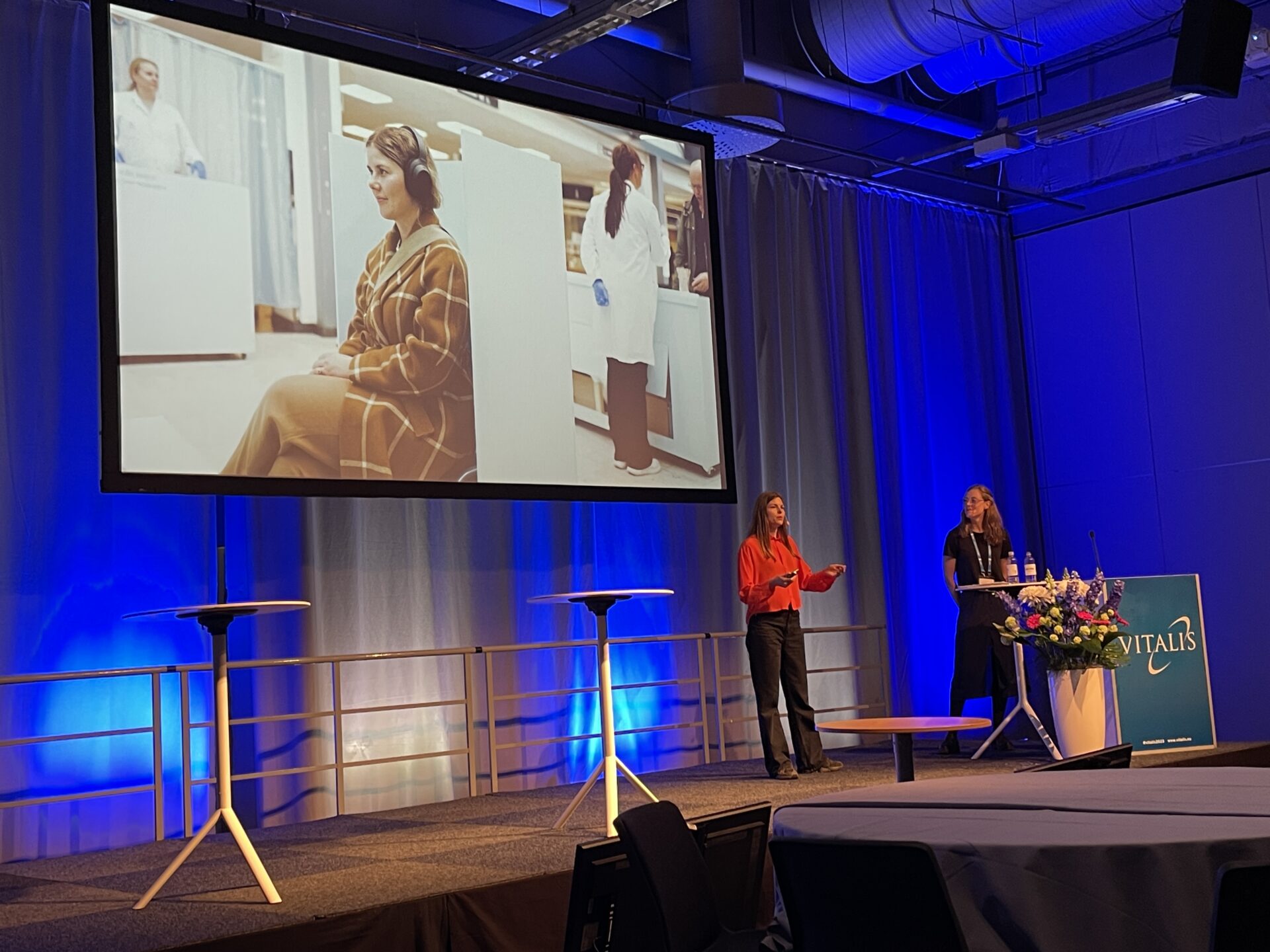
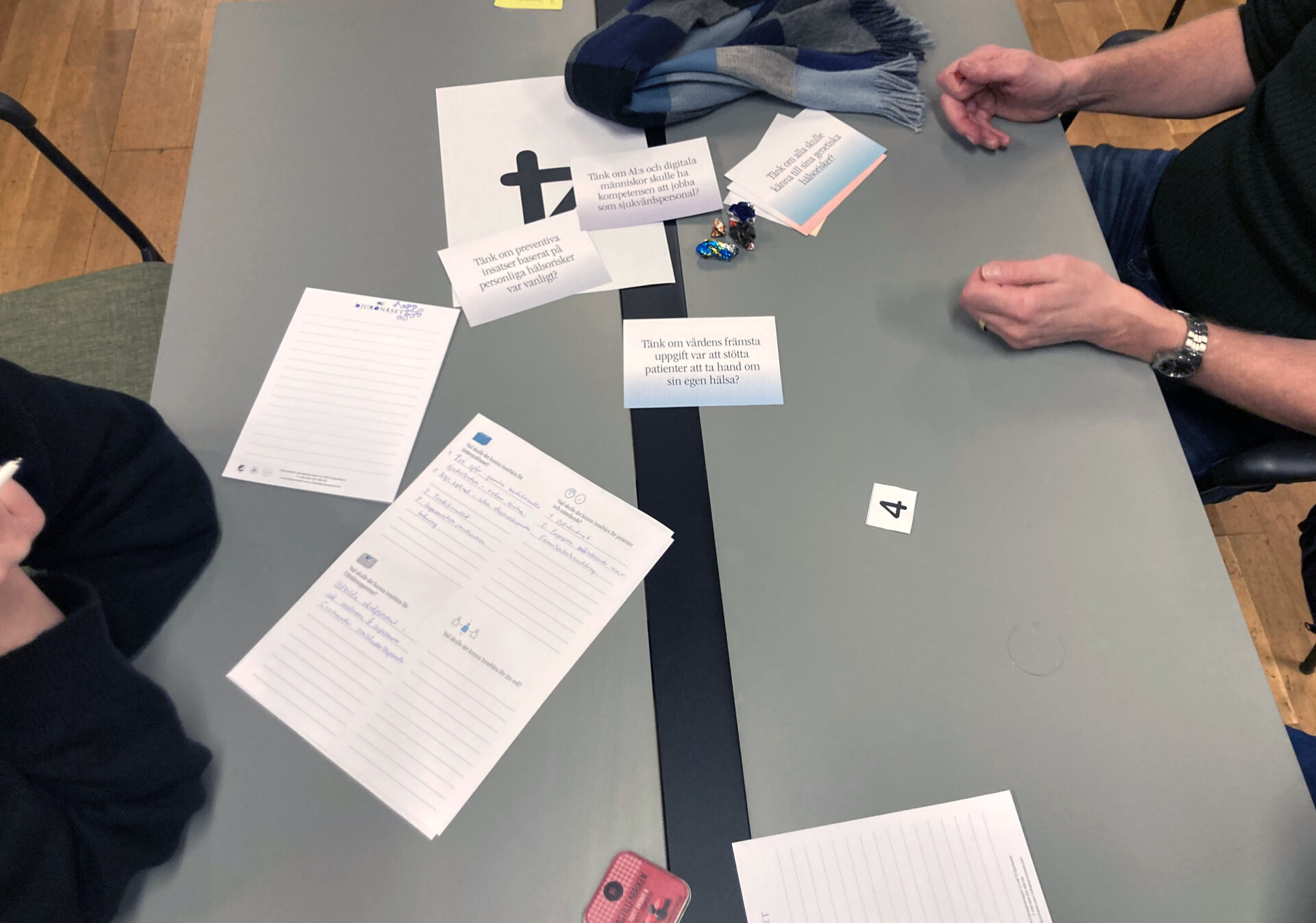
A week later, we took the opportunity to present the project to approximately 220 managers at the hospital. In a 75-minute on stage session, we guided them through the “Centre for Preventive Care” installation, shared the methodology we worked with, outlined some of the trends and signals that lay behind, and engaged them in a participatory workshop. Divided into groups, they were prompted to discuss specific questions and contemplate the implications for the future of healthcare.
For instance, they pondered over questions such as “what if everyone would be aware of their genetic health risks?” or “what if AI takes the role of caregivers?”. In these discussions they were asked to map out the potential impacts on society, on the hospital at large, but also on their own role, their wards, staff and patients.
Finally, they undertook an exercise in which they created their own future prototypes in the form of postcards. We encouraged them to visualize stepping into the future they had envisioned and, from the perspective of a future-self write a postcard.
The feedback from the managers on our session was overwhelmingly positive. Many expressed being inspired by the project and feeling creatively engaged in the exercises. They seemed to appreciate the dedicated time to contemplate topics and questions around the future, something they seldom find space for in their busy roles.
A stream of interest
In the months that followed, people approached us with requests to exhibit the installation, share our process and methodology, and to conduct workshops. While we did hold some presentations and workshops for diverse audiences, we soon realized that the interest was larger than what we had time and resources for. To accommodate the enthusiasm, we began sharing our PowerPoint slides enabling others to present the project and facilitate workshop themselves.
For instance, the cardiology department at Södersjukhuset employed our materials to engage their staff in discussions about the future of preventive care and Experiolab Karlstad used it to conduct a workshop involving a group of 200 Norwegian healthcare professionals. Furthermore, we observed that our project was being embraced as a compelling case of speculative design within the public sector.
Initially, we provided photos, videos, PowerPoint presentations, and printed workshop materials upon request. However, it became clear to us that a dedicated project website would make it much easier to share the material plus that it would allow for the dialogue to continue online. Thanks to additional funding from Vinnova, we were able to, as you see, bring this website to life.
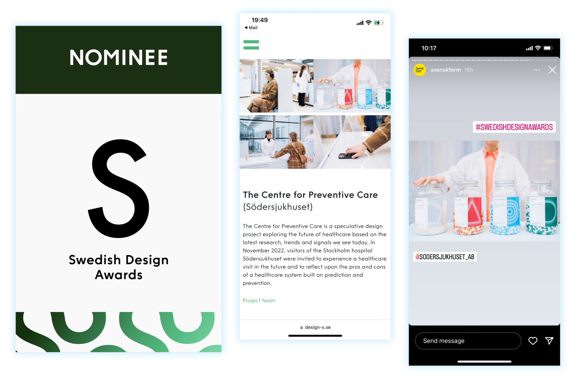
We also had the honor of being nominated for Design S, Swedish design awards, in the category Design for Systemic Transformation.
